If you’re not new around here, you already know we’re huge fans of typography. Well, some of us are just really big fans, but our man, Chris, also happens to be an authority on the matter. ::straightens bowtie::
To be clear, it’s not that we think typography is just cool, fun, or exciting (which it totally is). But we’re fans (and teachers) of type because of how wildly valuable it is to our work as designers.
We’re not saying you have to become an expert at it, but we are saying that you’d be doing yourself a disservice if you don’t learn some of the basic ins and outs of why it matters, how to use it, and how it can level up your expertise.
With that in mind, you might want to earmark this article for future reference ‘cause it’s got pretty much everything you need to know about getting started with understanding and implementing typography.
So, without any further ado – HERE. WE. GO!
What is Typography?
From font type and size to texture and spacing, typography is text's style, design, and appearance.
Born out of the ancient times of ~writing by hand~ (OoOooohh), typography exists everywhere that words do, and it touches nearly every aspect of a business—from visual design to brand messaging, style guides, and marketing strategies.
It should be pretty clear, then, that typography is a critical part of our work as designers. This is why we must stay hip-to-the-know on how to do typography and leverage it for our clients (and our own businesses).
On The History of Typography
Though the history of typography goes way, way, WAAAYYY back—think hieroglyphics and kanji—when we talk about it, we’re specifically referring to its use in design, starting with (drumroll, please) –
Expressive typography
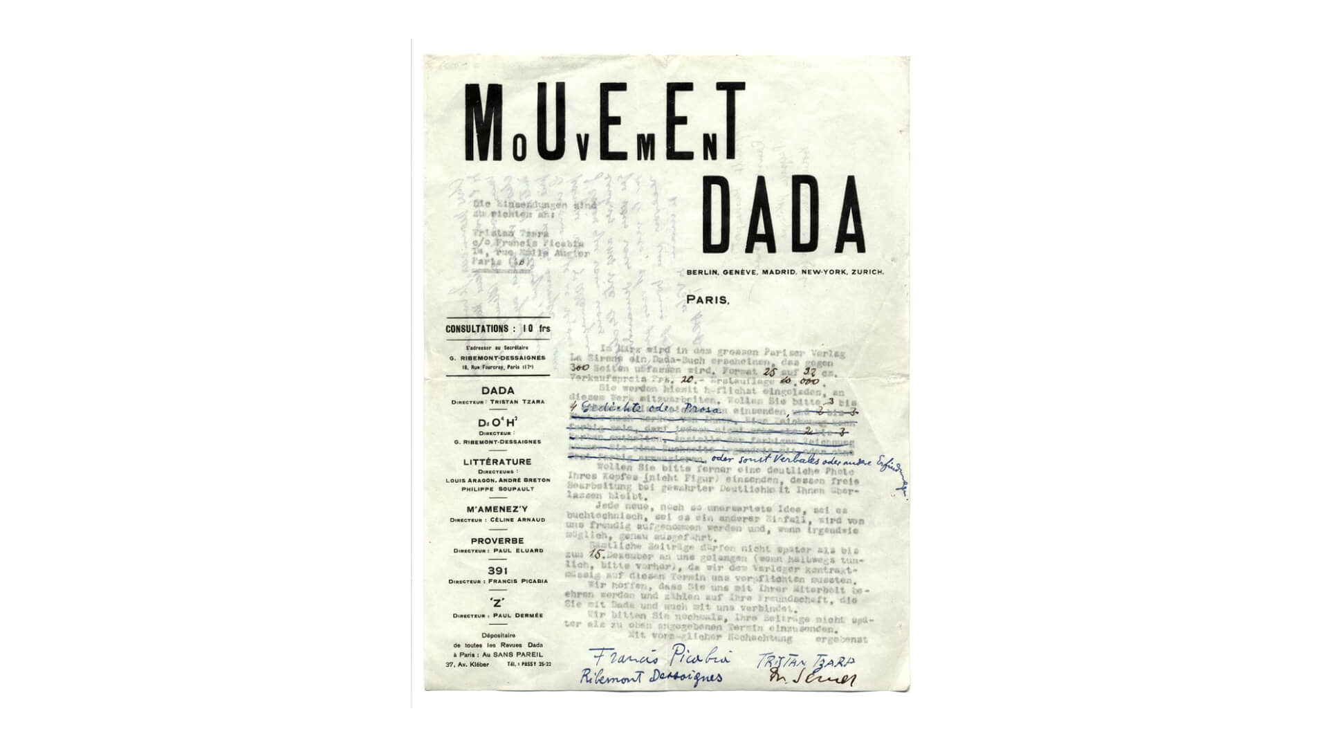
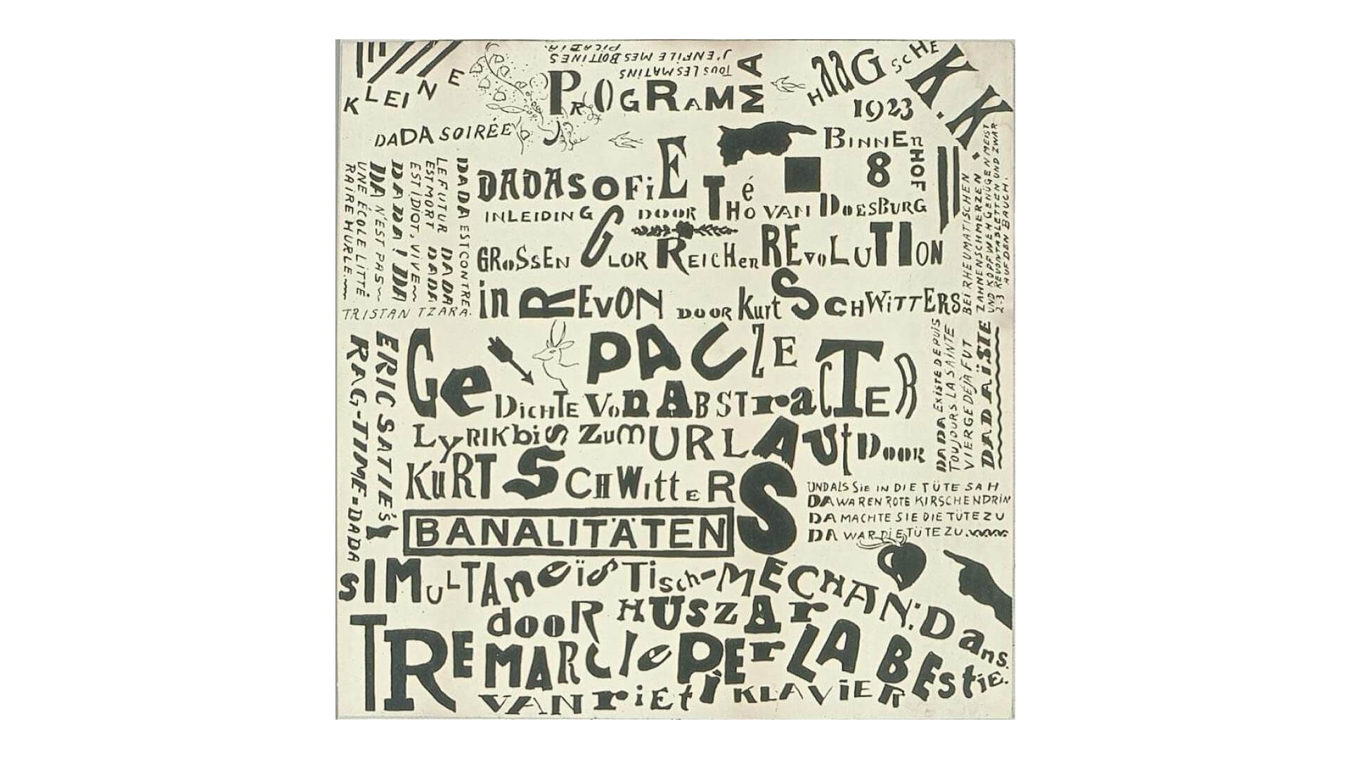
Expressive typography started popping up in design between the Futurist and Dada movements. In part, this was a way to more fully embody the various sensations and movements in work and express an idea.
The expression often rendered the straight-forward “message” unrecognizable, but that was the point! This was considered a revolutionary point of view ~back in the day~ and we still think it’s pretty rad.
As much as we could absolutely geek out about even just this one thing on expressive typography’s history, we’ll let Filippo Tommaso Marinetti close out this section–
“I undertake a typographical revolution directed especially against the idiotic and nauseous conception of old-fashioned books of verses ... Better still: my revolution is directed against what is called typographical harmony of the page ... I intend to redouble the expressive force of words."
Functional typography
Expressive typography is a tough act to follow, but functional typography fell right into place and started sending more concrete, literal messages. Wait a minute! How is that different from how we used type outside of design?
Great question! Let’s have a little reenactment.
Type said, “Look at me! I can press these letters into pages and tell you things!”
Expressive Typography asked, “What if we used those letters to make art?”
And finally, Functional Typography asked right back, “¿Porque no los dos?”
(cue the triumphant music and a whole lot of really beautiful, functional type)
Why is Typography Important?
It’s completely wild to us that typography is sometimes overlooked or pushed to the back of the stage in favor of the more ~glamorous~ design elements like logos.
And hey, we get it.
In many contexts, effective typography is practically invisible because it should besmooth that the reader doesn’t even notice it. But it is, somewhat secretly, a force to be reckoned with and a key design element with serious impact.
It does a lot of the heavy lifting in building brand recognition and creating connections between those brands and their current and potential consumers.
Just like all the other individual elements of design, typography communicates a message beyond words. As Ted "Theodore" Logan once said, “Whoooa.”
Giving voice to design
Good typography has the power to establish a visual hierarchy, set the overall tone of a product, service, website, or brand, and drive graphic balance. Pretty important stuff, if you ask us! “Back-up dancer” who? Typography’s the star of the show, baybee!
And, no joke, everything little thing she does is magic.
From the sharpness or softness of the font shapes to the color palette, letter size, and spacing- literally every decision you make about manipulating the existing type—or designing your original type—can positively or negatively influence the feeling, vibe, or voice of the design.
For example, fonts with bizarro or unconventional edges can change the tone of the message to fun and quirky, whereas other fonts might feel more classical or whimsical.
You might look at a compressed sans-serif or a simple, traditional font for a more serious or professional tone.
When you really know your stuff, you can start mixin’ and matchin’ these fonts and choose your own adventure to create the exact tone you want the reader to receive the message in.
Fortunately, “really knowing your stuff” can be so much sooner than you might have thought possible! We’ve got the course right here– hop into our typography course online to start now.
Oh, and remember, y’all, picking typefaces is only ONE of many elements you can adjust to change the whole of your design.
You can also line things up in a bunch of different ways with a grid and have fun with contrast, weights, and line breaks. You can play around with color and spacing, placement, and opacity. These can all communicate different personalities and tones.
Conveying a message clearly, effectively, and memorably
Have you ever seen a piece of art that made you cry? Or how about certain product packaging that made you scream, “OMG!” and then go show it to someone else?
The ability to clearly communicate a message, feeling, or action, is not just reserved for graphic or visual design. Your typography can also do this, which is why it’s so super important to include it as an intentional part of your design.
Personally, we’re still thinking about the typography choices of the FedEx logo. Sure, it’s been lauded in marketing programs for years, but it’s totally worth highlighting here.
From the subtle optical illusion of the image of an arrow between the “E” and the “X” (depicting action, movement, and direction) to the color choices (distinguishing their services while aiming to elicit feelings of quality and trust), to the spacing and font choice (creating a sense of service, speed, precision, and reliability). Once you see it all come together, it’s like magic.
If you let your type roam wild and free, it will still convey a message, feeling, or action, but you won’t be in control of it. So be intentional and be careful! ‘Cause you know what they say, “With great typography comes great responsibility.”
We're pretty sure they say that, anyway, and if they don’t already, they definitely should!
Influence
We’ve all been there- staring at four different salad dressings, all of a similar price, similar ingredients, but we hesitate. Which one should I pick? Does it even matter? Ultimately, we do pick one. But why that one?
Many little things influence our decision-making, and (surprise, surprise!) many of those things are a direct result of the typography choices made. Maybe you skip the one with the blue font because Ranch feels green to you (no? Just us?).
Maybe you gravitate toward the softer letters of a sans-serif typeface over a typeface with serifs. Often, we grab the one that has the recognizable design – I know this is the one I want because it looks like the brand I associate with Ranch Dressing.
In this example, we see how well-designed typography establishes authority, builds trust between a brand and its user, and grabs and holds the user’s attention, all while communicating the personality and essence of the brand. That’s a lot of work for one design element!
Accessibility
Aiming to provide a positive user experience through awesome typography skills isn’t just about what looks the coolest or most interesting.
According to the World Health Organization, 1 in 7 people (or 15% of the world’s population) struggle with basic interactions and tasks.
Every element of typography impacts readability and accessibility. So, to do our jobs responsibly, we must consider those with age-related conditions, poor vision, learning disabilities, dyslexia, aphasia, or low-tech literacy.
By understanding how typography can help or hinder the user experience, you can be sure your type does all the important things, like helping the reader find the beginning of each line or showing them exactly what to pay attention to and when.
Keep it legal! Making your typography accessible is the right and rad thing to do, but it’s also the law. Be sure to check ADA Compliance and the latest Web Accessibility Standards and Laws to stay in-the-know.
Different Types of Typography
The different types (pun intended and 100% necessary) of typography can overlap in a lot of places and in a lot of ways, but generally, we can break it down into these four categories:
No, print isn’t dead yet, and there are plenty of things to consider when we’re workin’ 100% digital for something that will eventually be physical. Interestingly enough, printed typography requires a lot of the same things as typography for the web:
Testing
Testing
And, finally, TESTING!
We have “proofs” when we print for a reason. Please, please use that test run to ensure everything comes out as you envisioned before ordering 3,000 prints. It’ll save you and your client headache and cash!
Look for legibility issues; does the type change when printed, is it bigger than you expected or not big enough? Stylistically, does it have the impact you’d hoped for, or does it look less va-va-voom now that it’s printed out?
Adjust accordingly and make a note of lessons learned for future reference. At the end of the day, we’re always learning, right? Right!
Digital
Similarly, we want to test and be sure that our web typography is responsive. This time, it’s not about what it looks like in its final iteration but rather what it looks like across different devices, platforms, and browsers (i.e., auto adjusting to fit different screens at different sizes).