


In my first two years as a young graphic design student in Amsterdam I often struggled with composition and layout until I saw the Quentin Tarantino classic, Pulp Fiction. My film and design tutor back then drew — with a whiteboard marker — horizontal and diagonal lines on the screen and divided the stills and moving images into clear compositions. It hit me, this is what makes graphic design less random.
But I still had a lot of questions about how to apply those composition rules to my own work:
- How wide should I make my text columns?
- How much margin do I add on the sides?
- What size fonts should I use and what about leading?
- How can I create a grid again while making it look different?
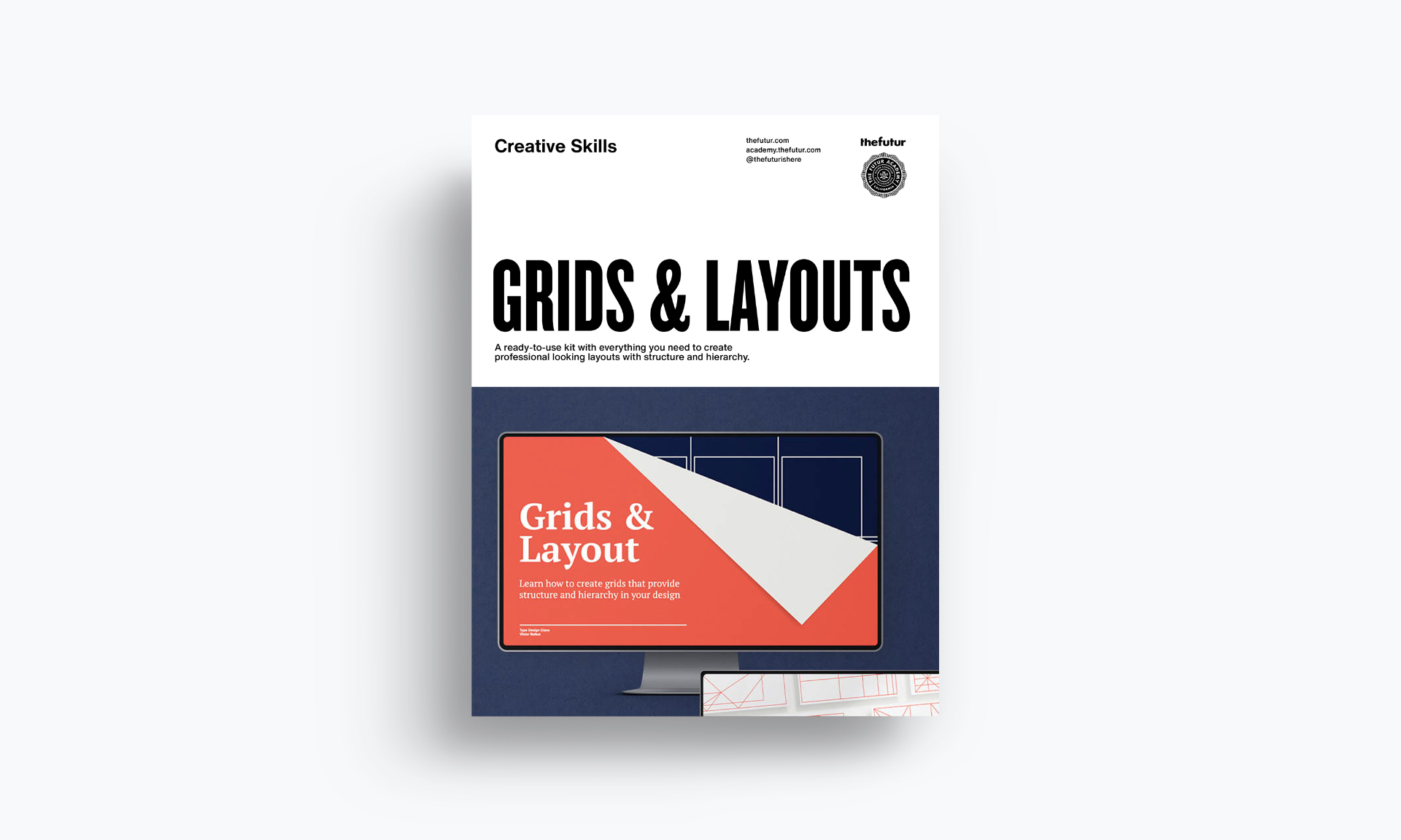
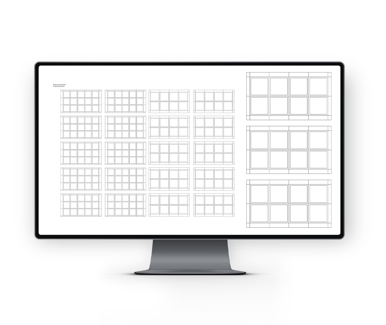
To me, graphic design is as much an art as it is a science. I created this Grids & Layout Kit to teach you the steps you need to create professional looking layouts filled with text and images.
We'll look at how the product you are designing for changes the layout. We'll also design grids that are easy to use in multiple ways and dive into all the different compositions that make your end product well-balanced, organized and look professional.