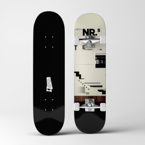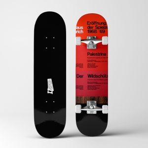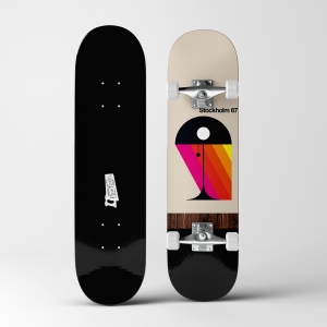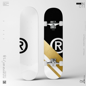
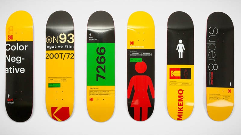
This was such a genius idea to mash-up two iconic brands in unexpected ways. I was drawn to the simplicity, typography, colors and distinctive graphics. Meanwhile, I had spoken to some amazing guests on The Futur and they all seemed to echo the same message—work on personal projects. This was vital to being an artist. We heard GMUNK, Elizabeth Carey Smith and Baugasm all say essentially the same thing.
As I was searching for something that I could do on a daily basis—tight parameters, easy and fun to do, didn’t require special equipment or space to produce—it came to me. Eureka! Go back to the start.
You see, my love for design didn’t begin with the works of Paul Rand, Herb Lubalin, Lou Dorfsman or Bradbury Thompson. It began with skateboarding. Yes, skateboarding.
While many “serious” skateboarders picked decks based on their affinity towards a particular skate brand, professional rider, or board shape, I mostly picked boards based on the visual appeal. As a kid growing up in the 80s, I was drawn towards brands like Santa Cruz skateboards, especially the illustration work of Jim Phillips: The screaming hand, Rob Roskopp melting face, Jeff Kendal snake bite, Jason Jesse Neptune & Sun God, and Corey O’Brien’s Grim Reaper. Then there was Vision’s Psycho Stick, Gator’s mesmerizing Op-Art spiral and the instant classic Mark Gonzalez deck. This list wouldn’t be complete without mentioning skateboarding giant Powell Peralta. My favorite was Steve Caballero’s Dragon, Mike Vallely elephant, Tony Hawk skull hawk, and Mike McGill’s skull/snake. Other notable mentions: Christian Hosoi hammerhead, Chris Miller man/dog, and SMA’s Natas Kaupas design.