Listen up, fellow designers- we can and absolutely should learn how to do typography.
The good news is, it doesn’t need to take years off your life or thousands of dollars to add it to your design toolbox, yet it can elevate pretty much every design you do from this point on.
How it does that depends on the kind of design we’re talking about.
Sometimes we’re aiming for something flashy and memorable, but when it comes to typography for websites, the goal is to be SO good it’s basically unnoticeable.
Well, for typography nerds like us, we’ll totally notice and appreciate a thoughtful design. But the best website typography design is so readable, accessible, and logical that the user doesn’t even notice it!
Readability
So many typographic elements factor into readability. So, let’s start by talking about the “Triadic Relationship.”
Hold up! Before you hit the 'back' button because this sounds a whole lot like math, don’t be scared. It’s actually super simple!
The Triadic Relationship refers to the harmony between type sizes, line length, and interline spacing; when you adjust any one of these three, you will be helping or hurting the legibility of your text.
You can learn to control all of these elements beautifully in our typography course online, but for now, let’s get the basics down. We’ll tackle spacing first.
Spacing
There are a few ways to adjust the spacing of your text.
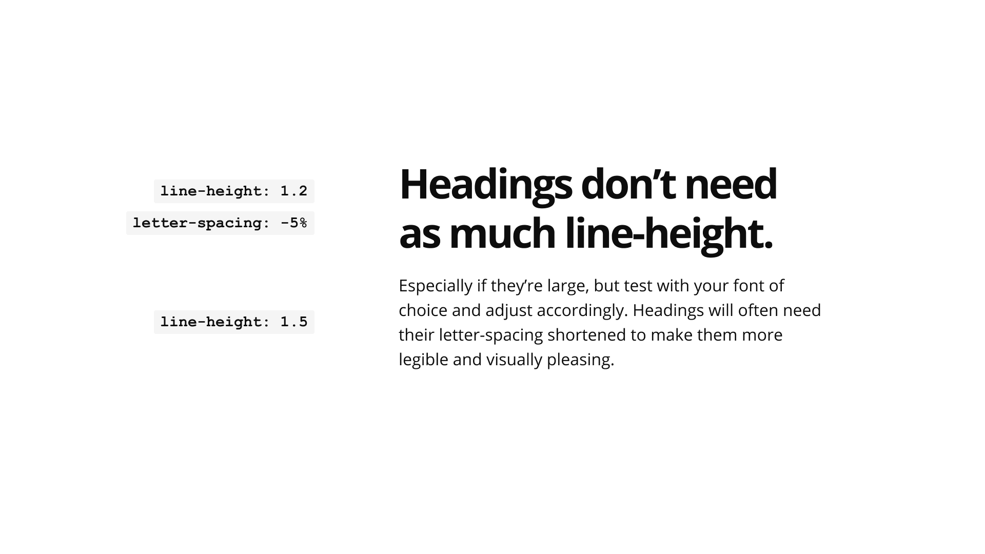
‘Letter-spacing’ is about adding and removing spacing between letters. Often confused with kerning (which can’t be controlled in CSS), letter-spacing impacts the entire line of text.
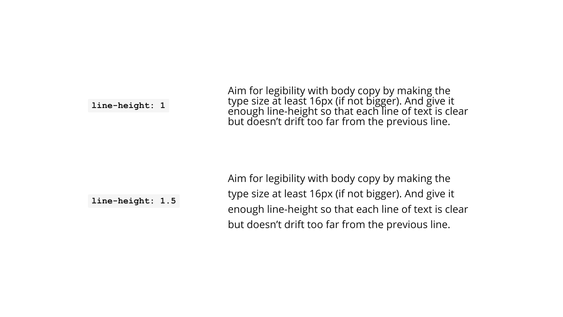
And, ‘line-height,’ also known as leading, refers to the vertical distance between two lines of type. It’s measured from the baseline of one line to the baseline of the next.
Too close together and the letters can blur into one, or the eye might return to the same line over and over again.
Too far apart and the ideas being expressed seem less connected to each other which may lead to readers skimming right past the most important bits.
For body text, a spacing of 1.5 is recommended. For headings and between paragraphs, spacing should be greater. Start at 2.5 and make adjustments from there.
This is a great time to activate your inner Goldilocks and keep trying until you get it juuuuust right!
Line Length
Using the right line length is crucial, partly because breaking things up makes them literally easier to read, but also because the human brain is just so picky.