
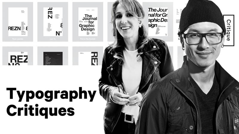
In the upcoming weeks, Chris will be holding live critique sessions on our Academy channel for new and current Typography 01 students. Each week, students will receive a certain set of parameters to work with and submit their layouts to get live, on-the-spot feedback. With the help of type instructor and Creative Director, Milka Broukhim, both Chris and Milka will teach students how to break down type to use it effectively.
Because typography is such a crucial design skill to have, it makes it that much more intimidating to approach. But if you have someone helping to point you in the right direction, you'll quickly learn to embrace this design discipline to take your layouts to the next level.
If you want to participate and get your work critiqued by Chris for the next livestream, click here to join our global classroom in Typography 01.
If you have typography work of your own that you’d like to critique yourself as you watch and follow along, use this checklist:
- Focal Point - What is drawing your eyes to a specific point on a layout?
- Order - What are the most important pieces of information, and what order are they in?
- Surprise - Where does contrast come into play?
- Negative Space - Does the design have breathing room?
- Details - Once items 1-4 are checked off, what additional details can you see?
Let’s take a peek at the major takeaways from each feedback session.
Week 1: One Weight, One Point Size
For this first exercise, students are working only with Helvetica Regular at an 8 point size. Here’s what we learned:
Rivers in typography
If you’re just starting out with type, it’s highly advised you start by justifying your copy left. Our eyes focus on the content of the layout just as much as the negative space. If the text is force justified, it creates gaps, or rivers, that throw off the balance. In general, you want to avoid rivers.
Group items to an axis to make a focal point
Throughout your layout, elements should sit along an axis line to show that they’re from the same group.
Proximity communicates grouping, so if you have items that are placed closely together along the same axis, that also tells our eyes that those components are related in some way.
What grids are and what they’re used for
Grids help to keep things ordered, aligned, and balanced. They eliminate chaos and make layouts pleasing to the eye.
For more, watch the full critique here:
Week 2: Two Weights, One Point Size
For week two, type instructor Milka Broukhim joins Chris to help with the critiques. Milka has taught typography to over 1,500 students for 15 years at ArtCenter College of Design. Here are a couple of things we learned from Milka this week:
Do bad work
While it sounds counterproductive, it’s highly encouraged. The only way you’ll learn, as Milka puts it, is to do bad work. Make as many mistakes as possible to learn from them.
Soak up design wherever possible
As we go through these critiques over the next few weeks, take note of where you can improve based on Chris’s feedback. Then, take it a step further and look for other sources of layout inspiration and instruction online, from other designers, or in books.
Watch the full critique here:
Week 3: One Weight, Two Point Sizes
Milka Broukhim joins us for our third week of typography critiques. In this week’s session, Chris and Milka teach the students “how to see” based on their layouts using only one weight and two point sizes. Here’s what we learned:
Master the fundamentals before you experiment
If you jump into your layout design without some grasp of design fundamentals, you might get lost down the road. It’s important to keep the fundamentals in your back pocket at all times. Then, when you’ve got a good sense of them all, play and experiment away. The world of design is much bigger than you think.
Increasing space disconnects ideas
You want to make sure that your body of text has a healthy amount of space between lines. This tells us that the copy is related.
Purpose and function
Form and function work together. A beautiful visual layout only creates an impact when there’s purpose behind it. The form of the layout has to follow the purpose to make an effective design.
Watch the full critique here: