In the world of branding and design, logos serve as visual ambassadors for businesses and organizations, embodying their identity, values, and aspirations. While many logos convey their messages overtly, some hold hidden secrets—subtle, cleverly embedded elements that require a closer look to uncover. These hidden elements are like encrypted messages waiting to be deciphered, adding depth, intrigue, and often a touch of playfulness to a brand's visual identity.
From intricate symbols to subtle typography nuances, the art of incorporating hidden elements within logos showcases the creativity of designers and offers an engaging layer of storytelling.
Today we’re going to take a look at thirteen logos that have hidden elements within them, along with what they mean for the brands behind them.

Amazon
Amazon's iconic logo embodies a subtle yet powerful message within its design. The simple, understated arrow stretching from the letter 'A' to 'Z' isn't just a mere design element; it's a clever and strategic choice representing the range of products available on the platform.
The arrow's trajectory from 'A' to 'Z' serves as a clever visual metaphor, signifying offering everything imaginable, from A to Z, to its customers. It also subtly communicates the idea of completeness and comprehensiveness, suggesting that Amazon is a one-stop destination for virtually anything a consumer might need or desire. It's an ingenious way of encapsulating the brand's mission within a minimalistic and easily recognizable mark.
FedEx
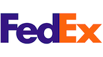
The FedEx logo is a masterclass in incorporating a hidden yet impactful design element. For many, the logo appears simple, with the company name in bold purple and orange lettering. However, upon closer inspection, the subtlety of the design reveals an ingenious arrow formed by the negative space between the letters 'E' and 'x'. This arrow serves as an inconspicuous yet clever element that holds a deeper meaning and symbolism.
The hidden arrow subtly represents speed, precision, and efficiency, reflecting FedEx's commitment to delivering packages swiftly and accurately. It encapsulates the essence of their business—moving forward and delivering with precision, while also hinting at progression and momentum.

Tour de France
The Tour de France logo is a prime example of visual storytelling through subtle yet impactful design elements. Initially appearing as bold and dynamic typography, the logo cleverly incorporates an intricate detail within the lettering. The cyclist figure, subtly formed by the negative space within the letter 'R,' symbolizes the heart and soul of the iconic cycling competition. It embodies the spirit of athleticism, endurance, and passion that define the race. This understated cyclist silhouette not only adds depth to the logo but also serves as a visual representation of the athletes who participate in this prestigious event, capturing the motion and energy synonymous with cycling.
By integrating this subtle yet recognizable element into the typography, the Tour de France logo evokes a sense of movement and dynamism, highlighting the essence of the race itself.

BMW
The BMW logo, comprising a circle divided into quadrants with a central inner circle, is a symbolic representation with historical significance. The design, often interpreted as a spinning propeller, pays homage to the brand's aviation heritage. However, the logo represents more than just aircraft engines. The interconnected white and blue quadrants are symbolic of the colors of the Free State of Bavaria in Germany, where BMW originated. Additionally, the circular shape signifies the company's commitment to perpetual motion and the pursuit of excellence. This iconic emblem encapsulates BMW's heritage, values, and dedication to pushing boundaries in the automotive industry.
Vaio
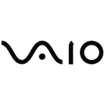
The Vaio logo is a clever fusion of analog and digital symbolism. It comprises two main parts: 'VA' and 'IO.' The 'VA' represents an analog wave, symbolizing traditional analog technology, while 'IO' stands for binary digits, indicating the digital realm. This amalgamation of elements embodies Vaio's expertise in seamlessly integrating both analog and digital technologies. It symbolizes their innovative approach to blending these two worlds, showcasing their commitment to advanced, versatile, and cutting-edge products that bridge the gap between old and new technology paradigms.
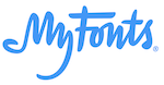
MyFonts
At first glance, the MyFonts logo appears as stylized typography, showcasing the brand name in a distinctive and legible font. However, the logo holds a hidden detail within the letter the word “My.” The hidden hand signifies the brand's dedication to providing a wide range of typefaces and fonts, which allow users to get their hands on any one they want.