Competition in the field of design is fierce. We all do what we can to stay in the game. We learn new skills (shout-out to our Typography 01!), grab all the free resources we can, and try to stay ahead of the curve and on the cutting edge.
Until we can get our hands on a real crystal ball or Doc’s Delorean, the only way to look into the future of typographic design is to look back.
A bit of a contradiction, we know, but so is “learn the rules so you can break them,” and that adage has yet to steer us wrong!
So let’s go back together and meet the foundation-layers, rule-makers-and-breakers, and early innovators of typography design. Then we’ll give you a heads up on who’s been shaking things up in the typography world more recently.
Leading Legends of Typography
PIET ZWART
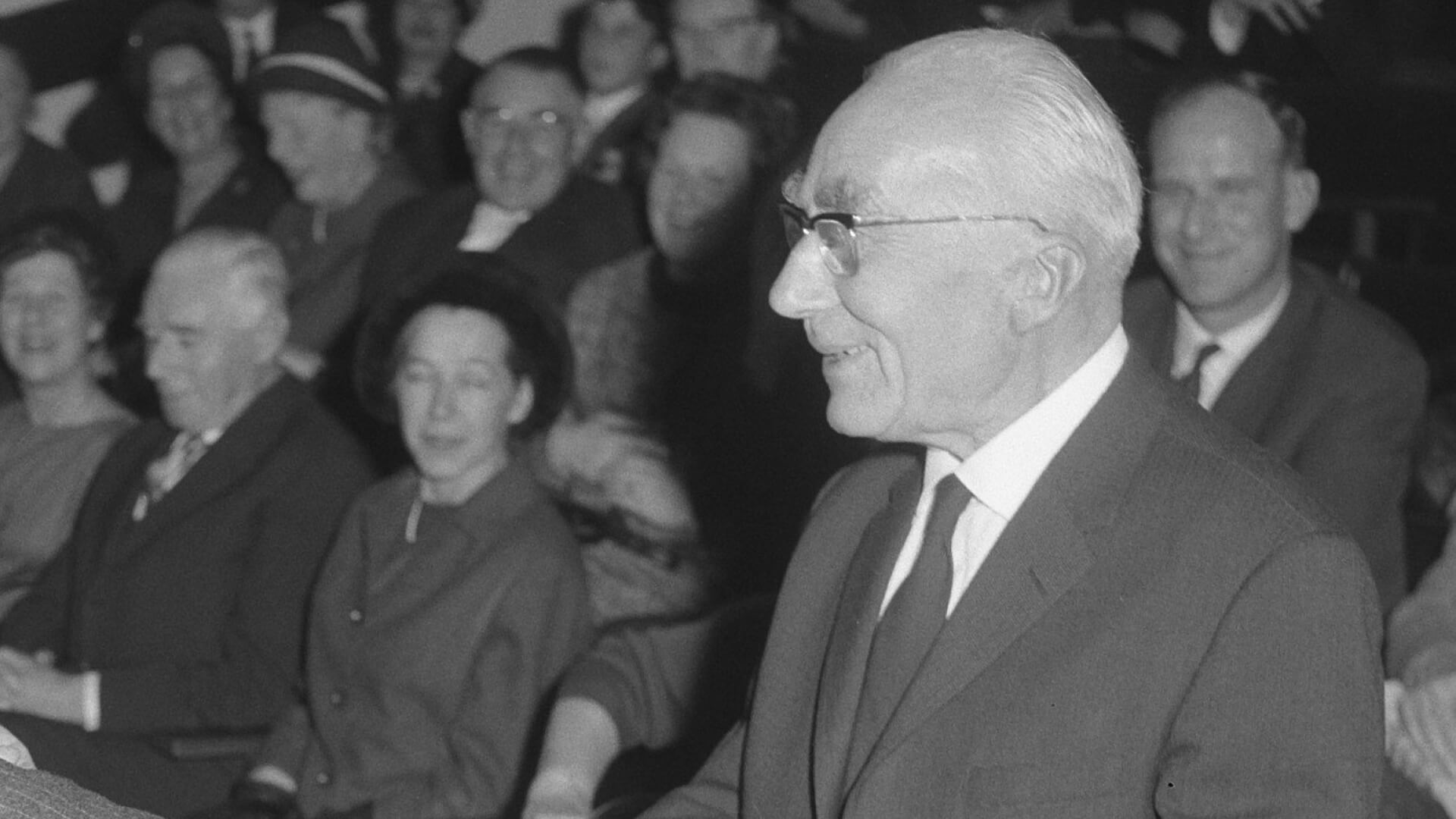
One of the absolute OG’s of typography design and a self-proclaimed “typotect” – graphic designer and architect, Piet Zwart was born in 1885. Yeah, graphic design has been around for a while.
Zwart is the perfect example of breaking the rules beautifully. His design played with traditional elements in new and interesting ways.
JAN TSCHICHOLD
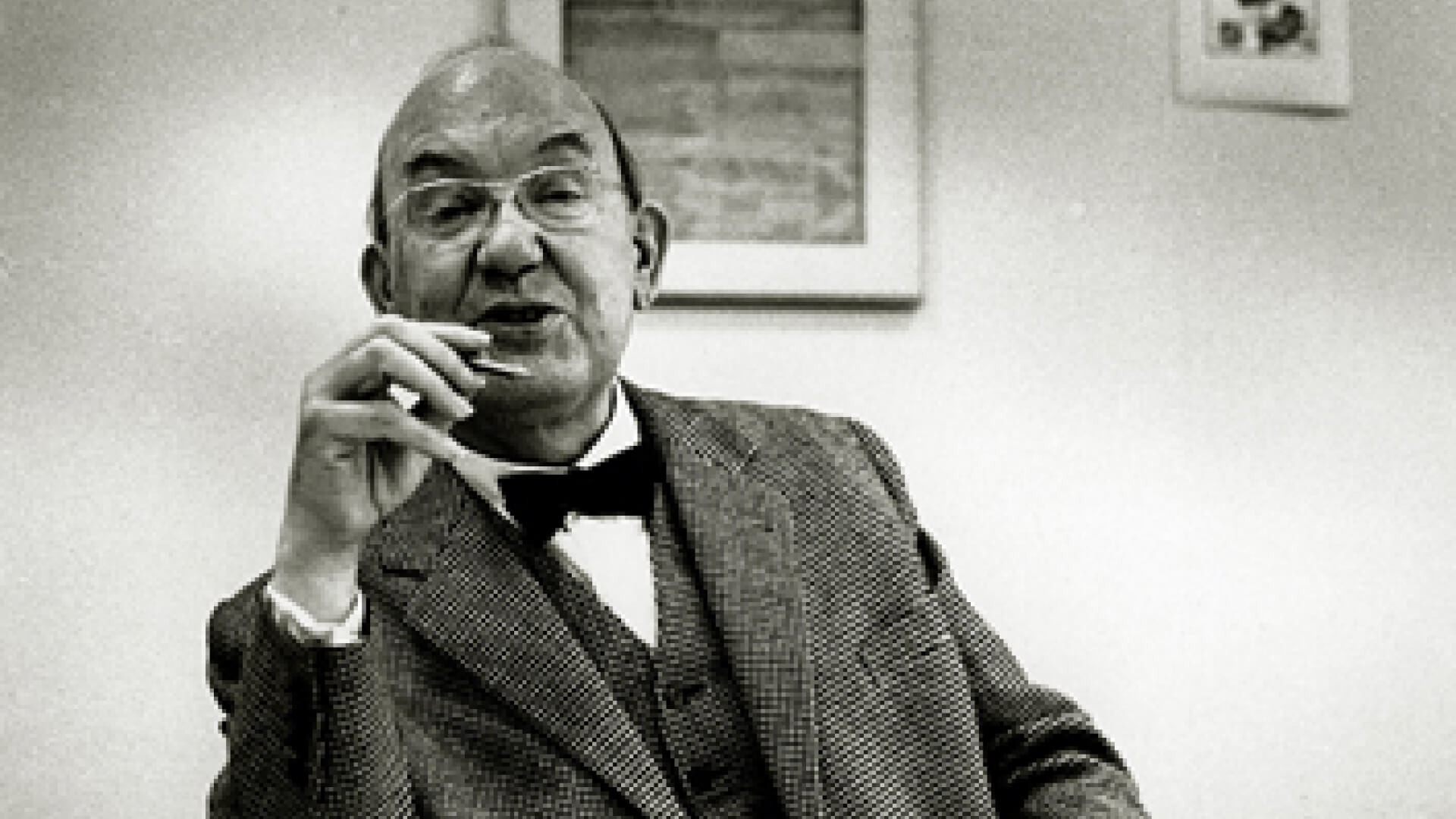
Tschichold was more of a rule-maker than a rule-breaker. He pushed for standardized paper sizes in publishing and created guidelines for establishing typographical hierarchy. We still use some of those guidelines today.
He’s also just super cool because he literally wrote the book on intentional typography design, “Die Neue Typographie,” and he designed the iconic orange covers for Penguin classics.
MAX MIEDINGER
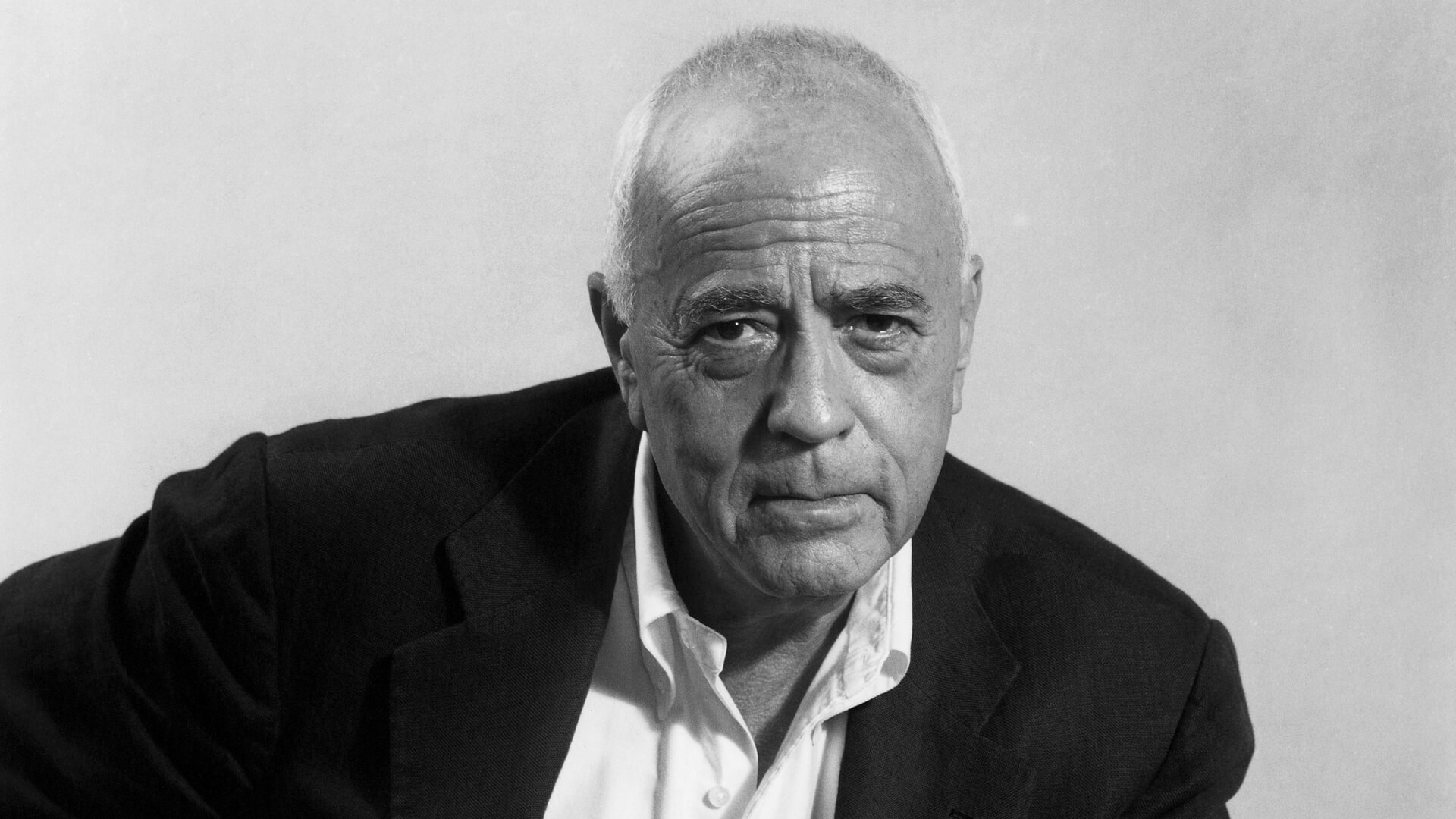
Born in 1910 in Zürich, Switzerland, Max Miedinger is the designer of one of the most used fonts in the world. He started his career in typography quite young, taking on an apprenticeship as a ‘typographic composer’ at the age of 16.
Fast forward to 1957, he designs a new typeface and calls it “Neue Haas Grotesk.” If you haven’t heard of this “most used” family of fonts before, that’s probably because it was renamed “Helvetica” in 1960.
So yeah, you could say he was a pretty big deal.
J. MÜLLER-BROCKMANN
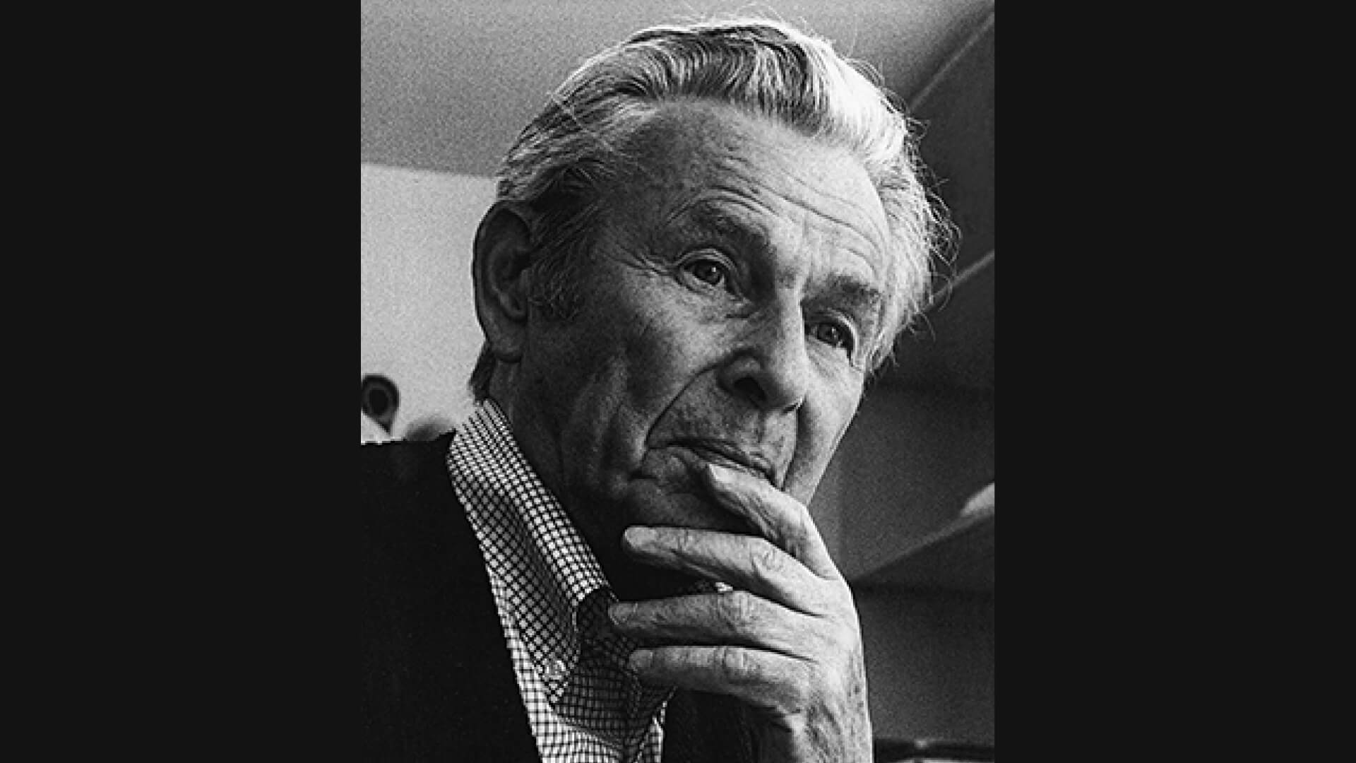
J. Müller-Brockmann was a “pretty big deal,” Swiss designer, too. In part because of his stunning work, but also because he gave us the gift of grids. You know we love our grids here, so we’re big fans of him.
Okay, so there’s more to him than just grids– he’s often referred to as the father of functional and objective design and a “pioneer” of the International Typographic Style. But for real, the grids are seriously a game-changer.
HERB LUBALIN
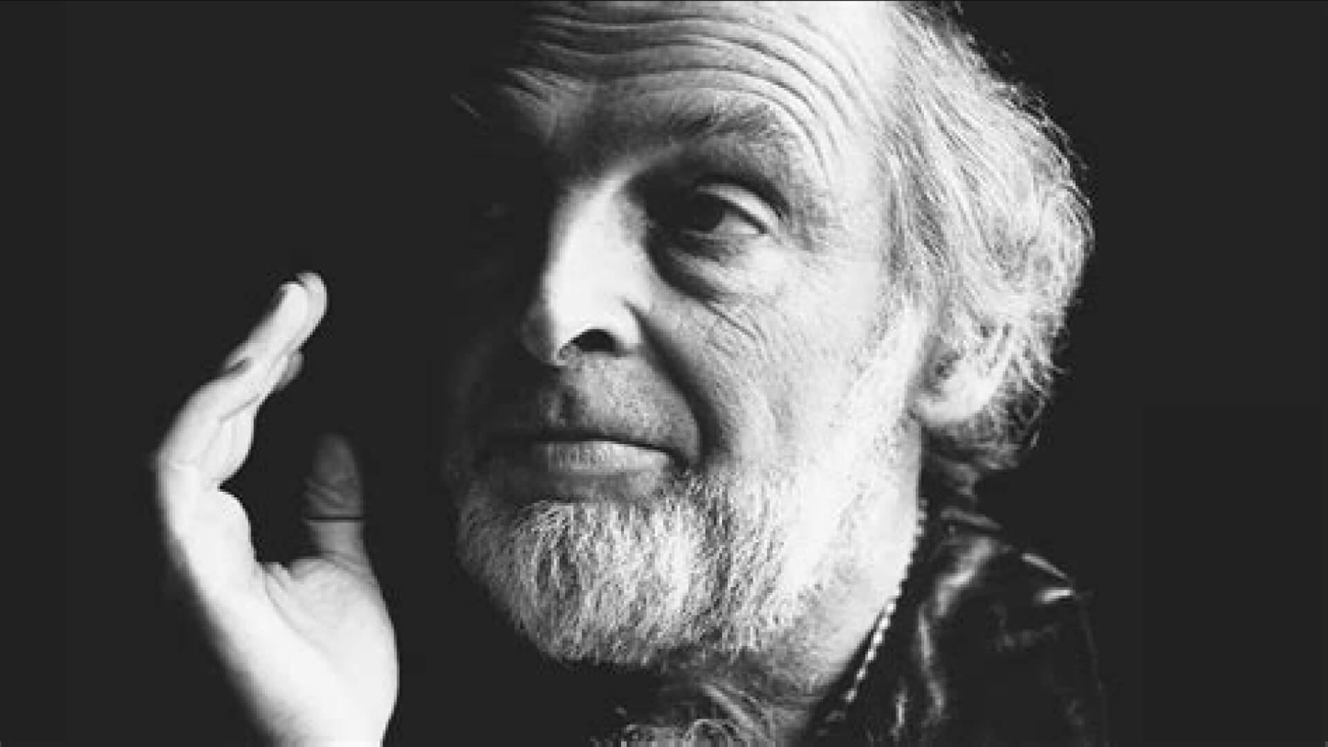
Herb Lubalin lives at the intersection of fun and functional. His designs, which he referred to as “typographics” are playful, but simple and effective. He brings type and image together like a perfect puzzle, using letterforms as part of an icon or an image.
His use of visual puns is difficult to describe, but impossible to miss when you see it.
CARLO L. VIVARELLI
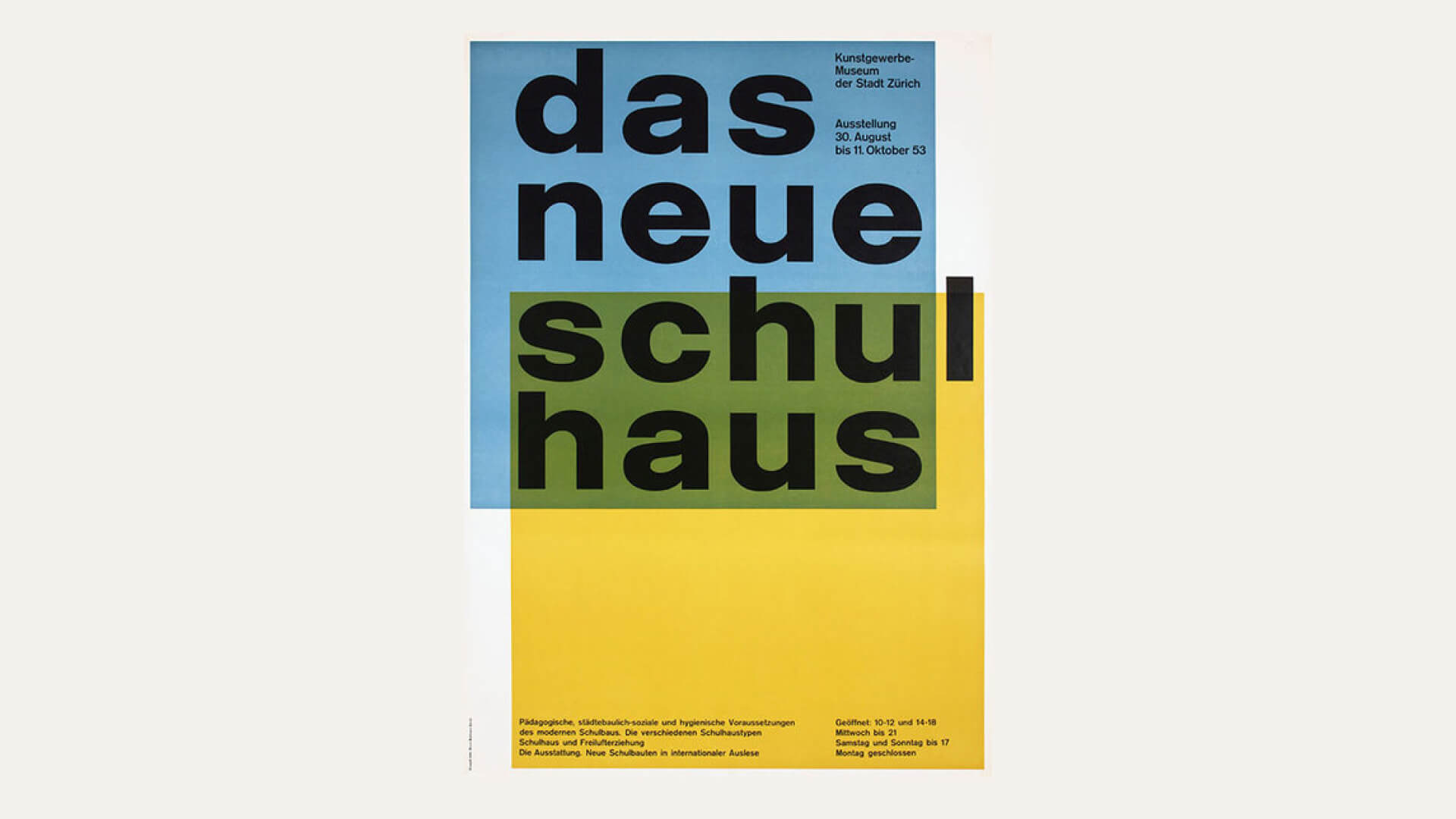
Another influential Swiss designer for the list, Carlo L. Vivarelli was a founding member of the Swiss design publication “Neue Grafik.” His design stands out because it is clean, clear, symmetrical, and bold.
ADRIAN FRUTIGER
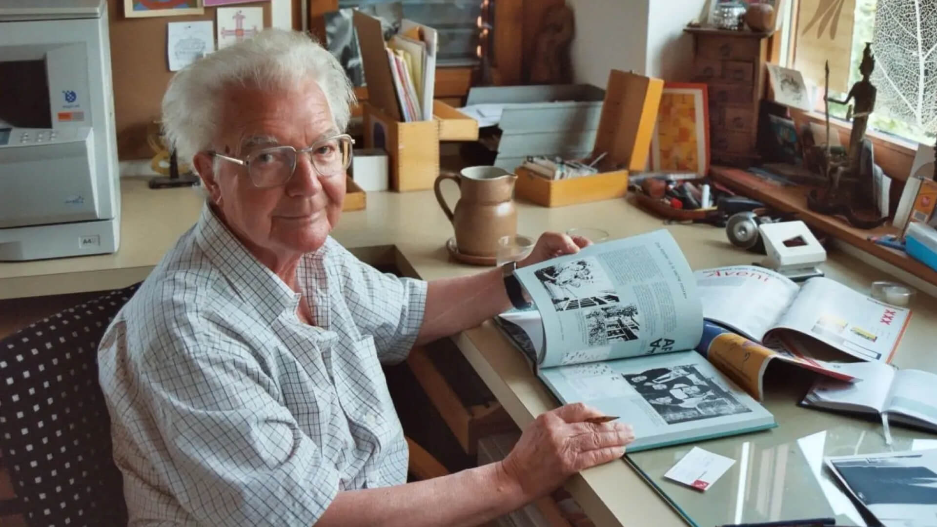
Adrian Frutiger was all about that balance between function and fashion. He believed that a good designer should be able to create truly beautiful typefaces without having to sacrifice readability.
He rose to his own challenge and created over 30 new typefaces that are both beautiful and readable. You’d probably recognize some of them, as they’ve been used on road signs all over the world. Point happily taken, Frutiger.
MASSIMO VIGNELLI