

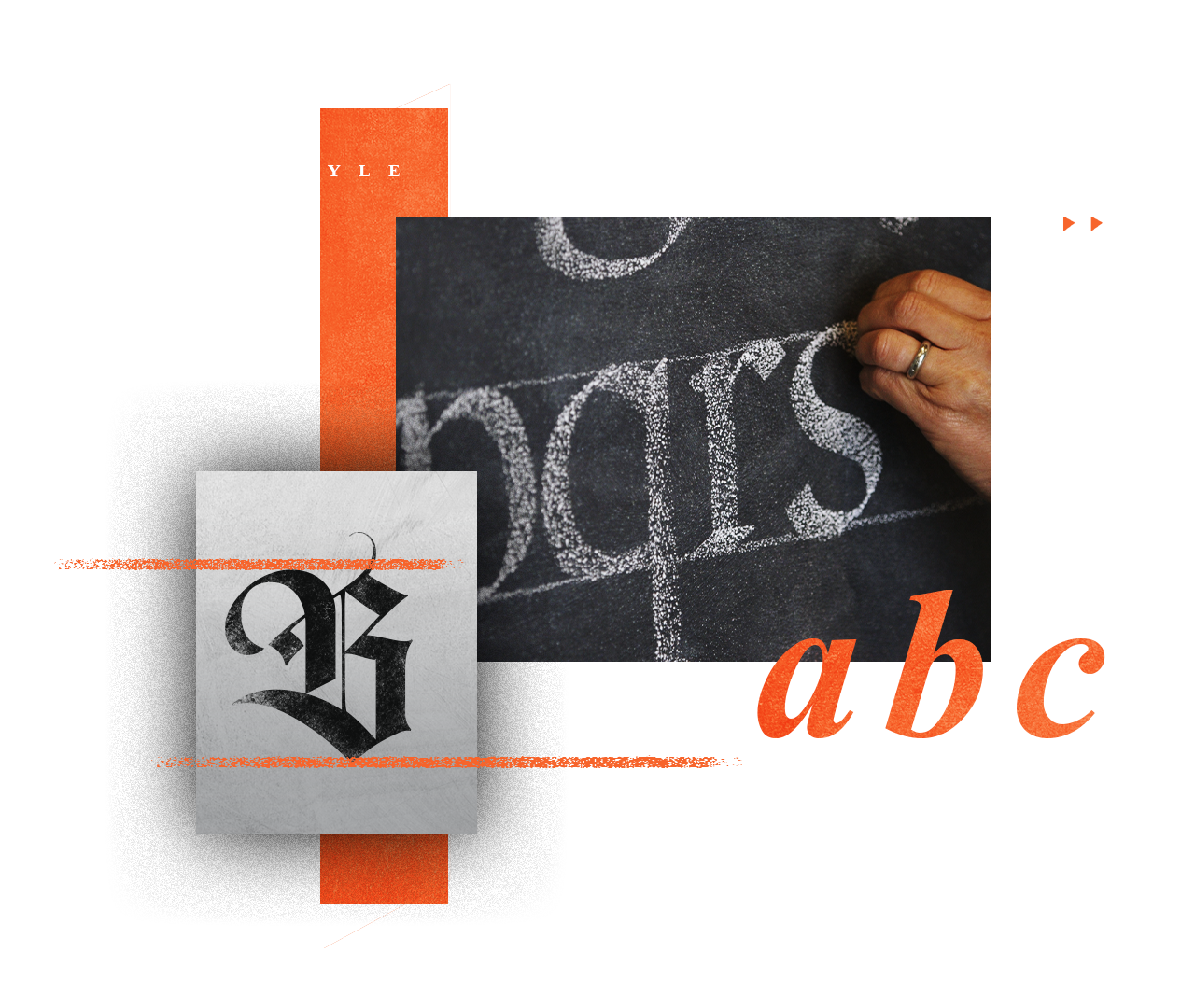
I was classically trained as a student at the ArtCenter College of Design in the late 1970s. We called it "Build up Lettering".
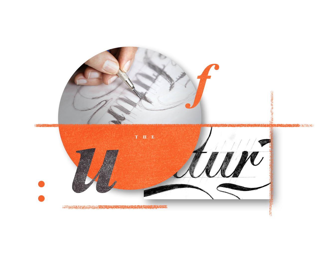
It involved three to four pencil renderings on tracing paper. Each tracing would be progressively refined toward a more exact version. It was a tedious and time consuming process, but therapeutic at the same time.
Little did I know, we were making the type then.
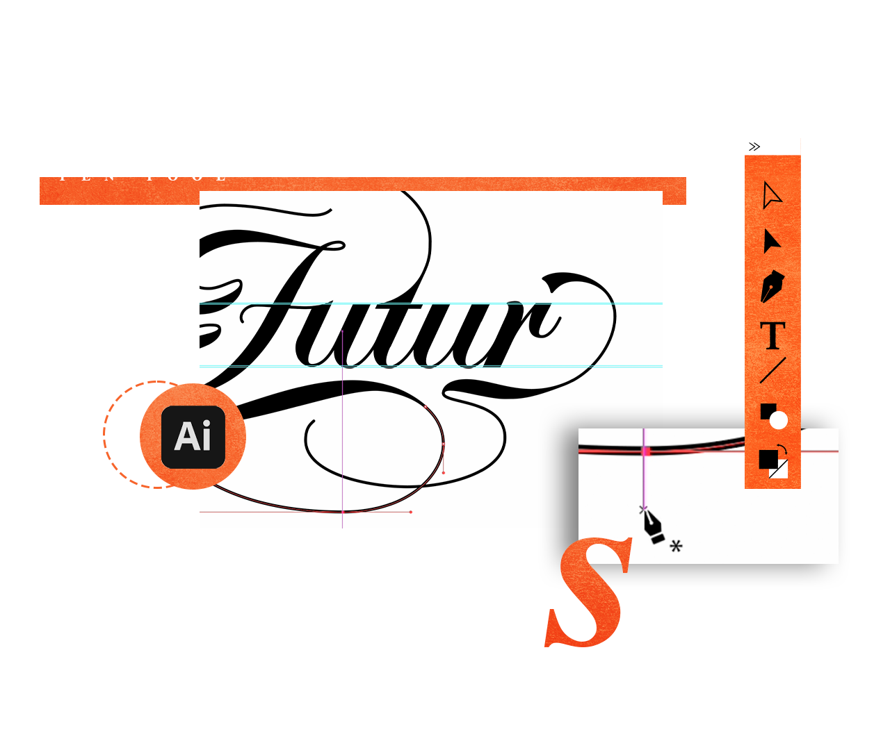
Lettering taught me how to see shape, proportion, and curve like nothing else. I could bend it, shape it and manipulate it from an informed place.
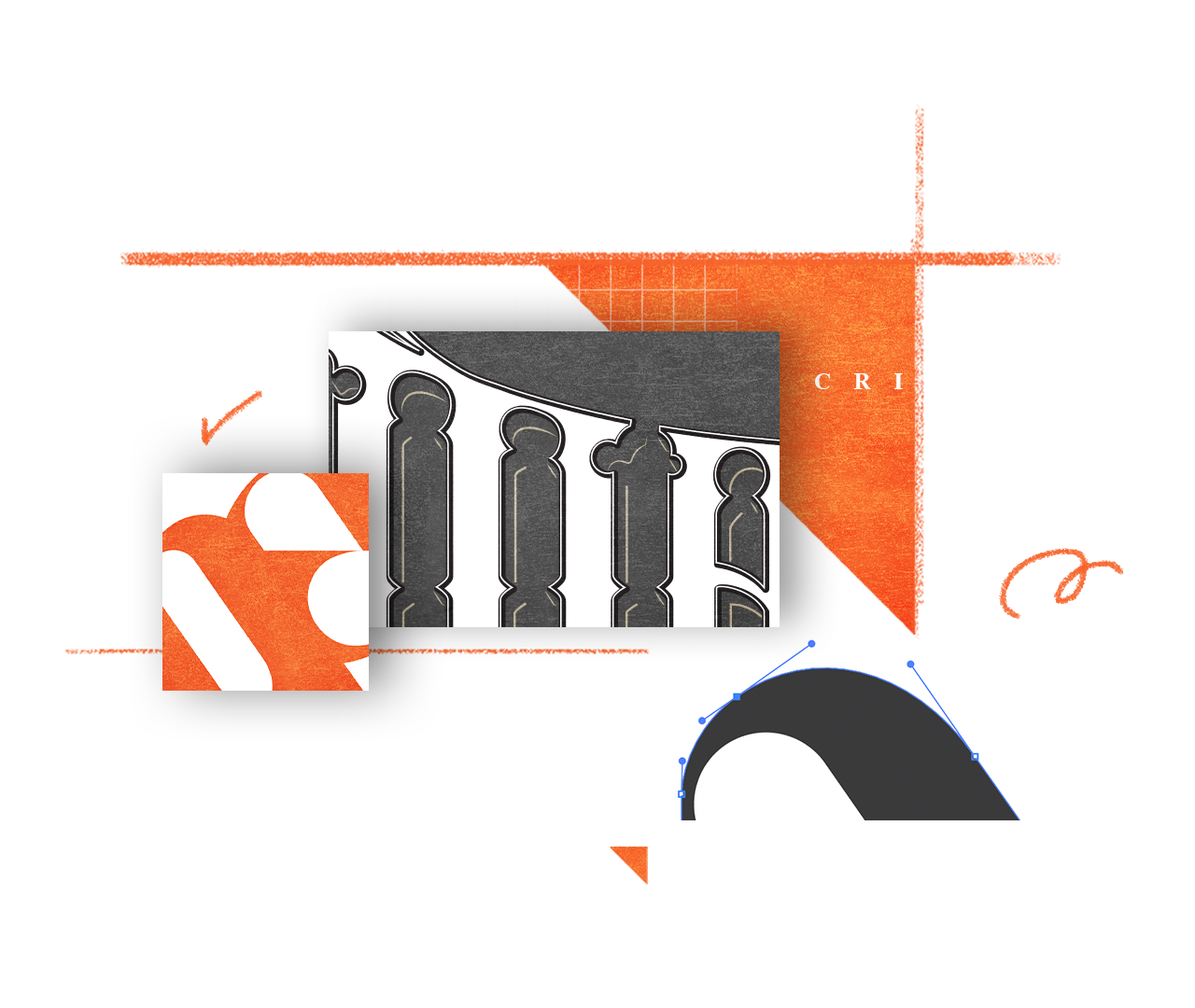
Learning to draw type has given me the power to make my type expressive without being enslaved by the grid or severe geometry that so often hobbles young designers.
Trends come and go. The current approach to custom typography is producing mostly letterforms that are geometrically aggressive and difficult to read. They may be interesting but, more often than not, are created to impress other designers.
Understanding of the organic nuances of hand-drawn letterforms allows you to create logos and brands that are warm, user-friendly and familiar—all while being unique and trademarkable.
I believe we should design for the masses and respect that audience. The "Chop and scale" approach with prefabricated type can only take you so far. Eventually your incompetence will show. What do you do when that happens?
Start with lettering.
When you have a client that needs an old logo refreshed, you're the go-to-person for the job. When you could use some flourishes, decorative elements, dimensionality, you'll know what to do and more importantly, HOW to do it without embarrassing yourself.