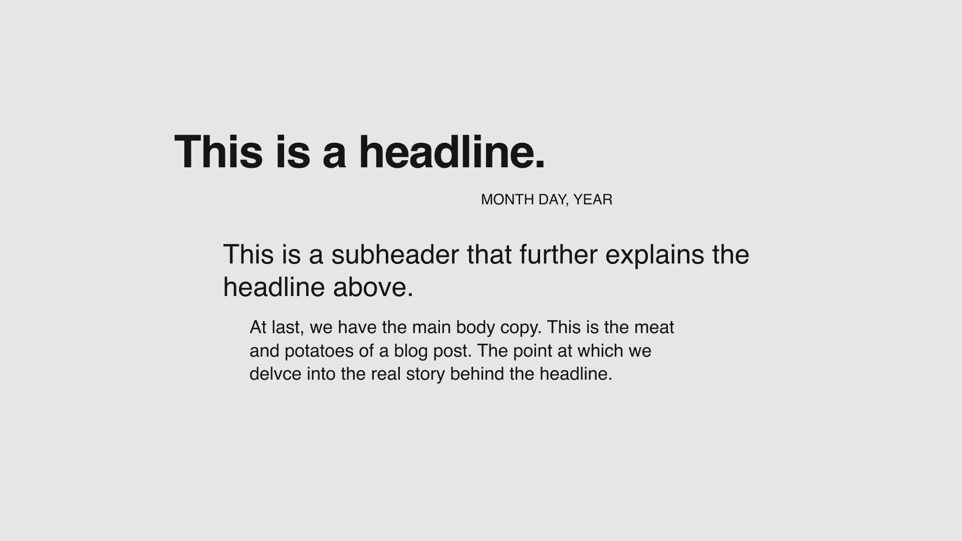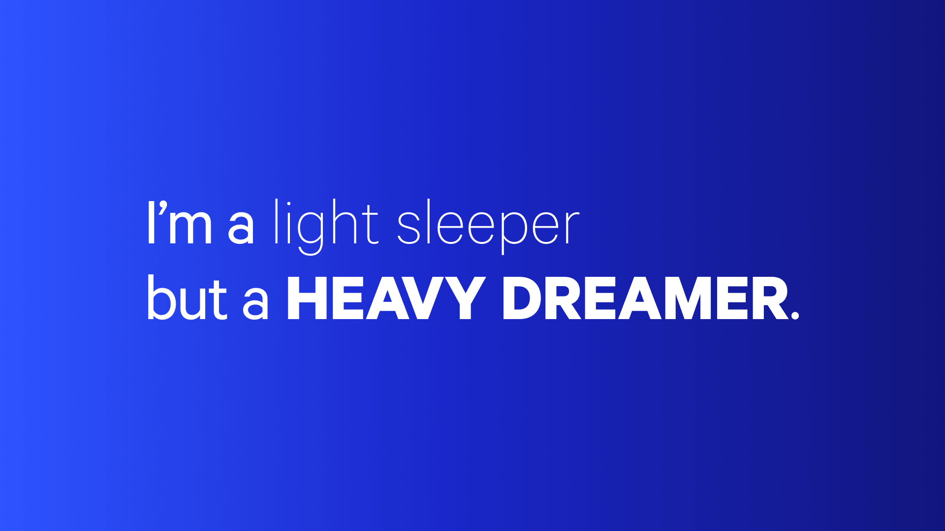
What's a typography crime?
Well, typography crimes are basically the worst mistakes we see in typography design and almost any designer is capable of committing them. To save you some time, aggravation, and embarrassment, we rounded up the best (worst?) examples for ya:
(cue the Law and Order theme)
Crime #1: Using a Bad Font
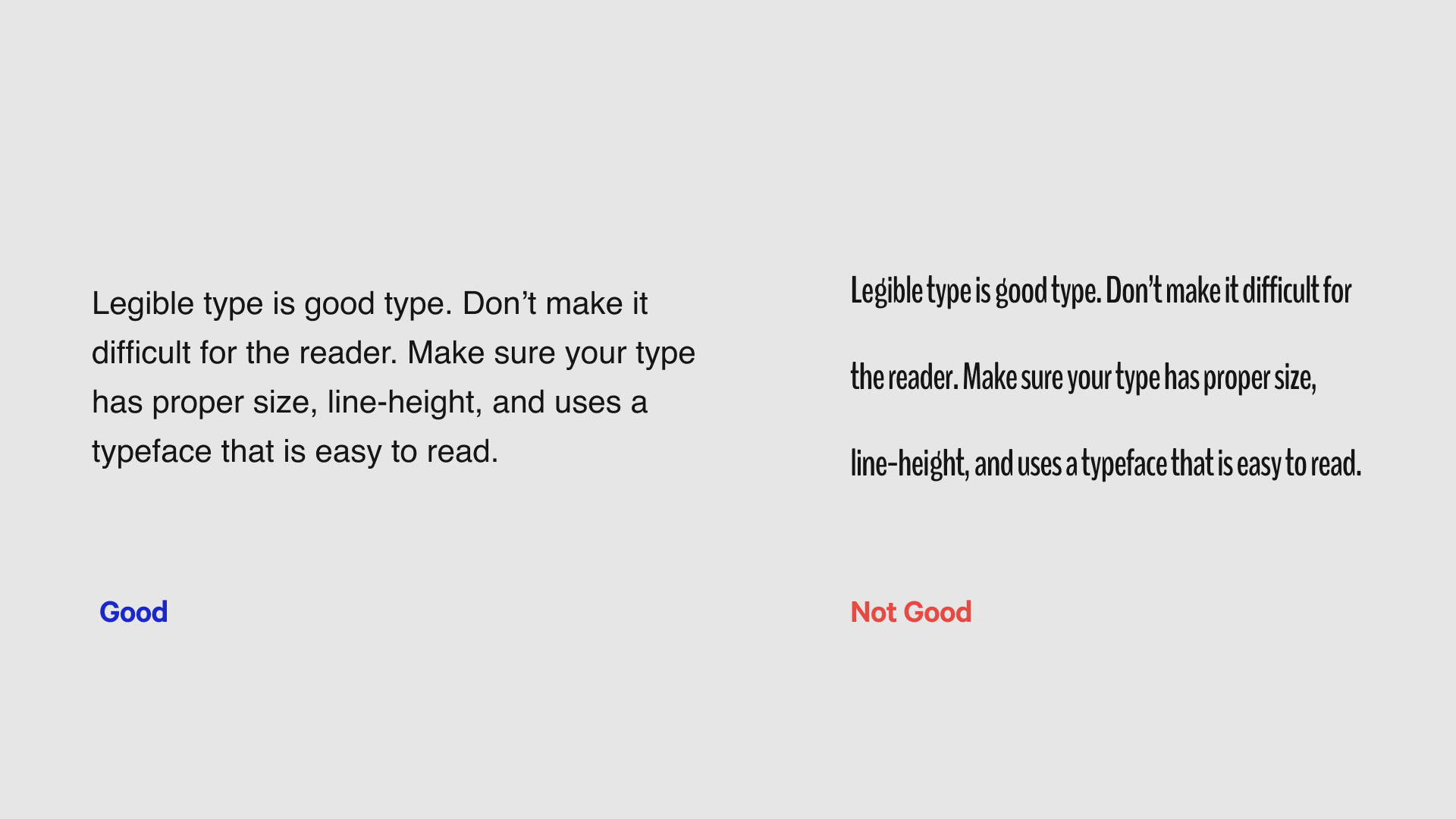
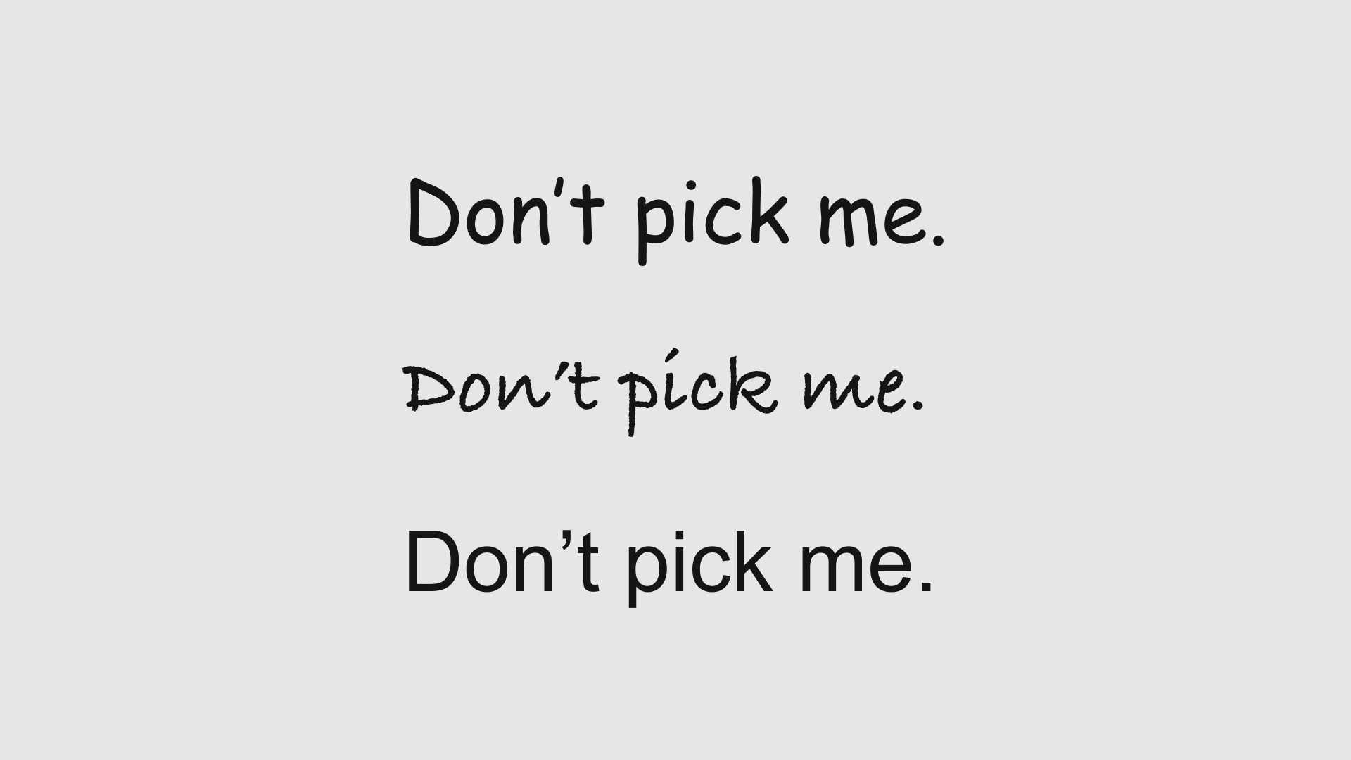
What makes a bad font bad? Lots of things! Some are difficult to read, others can be distracting or just plain overused.
What to do instead:
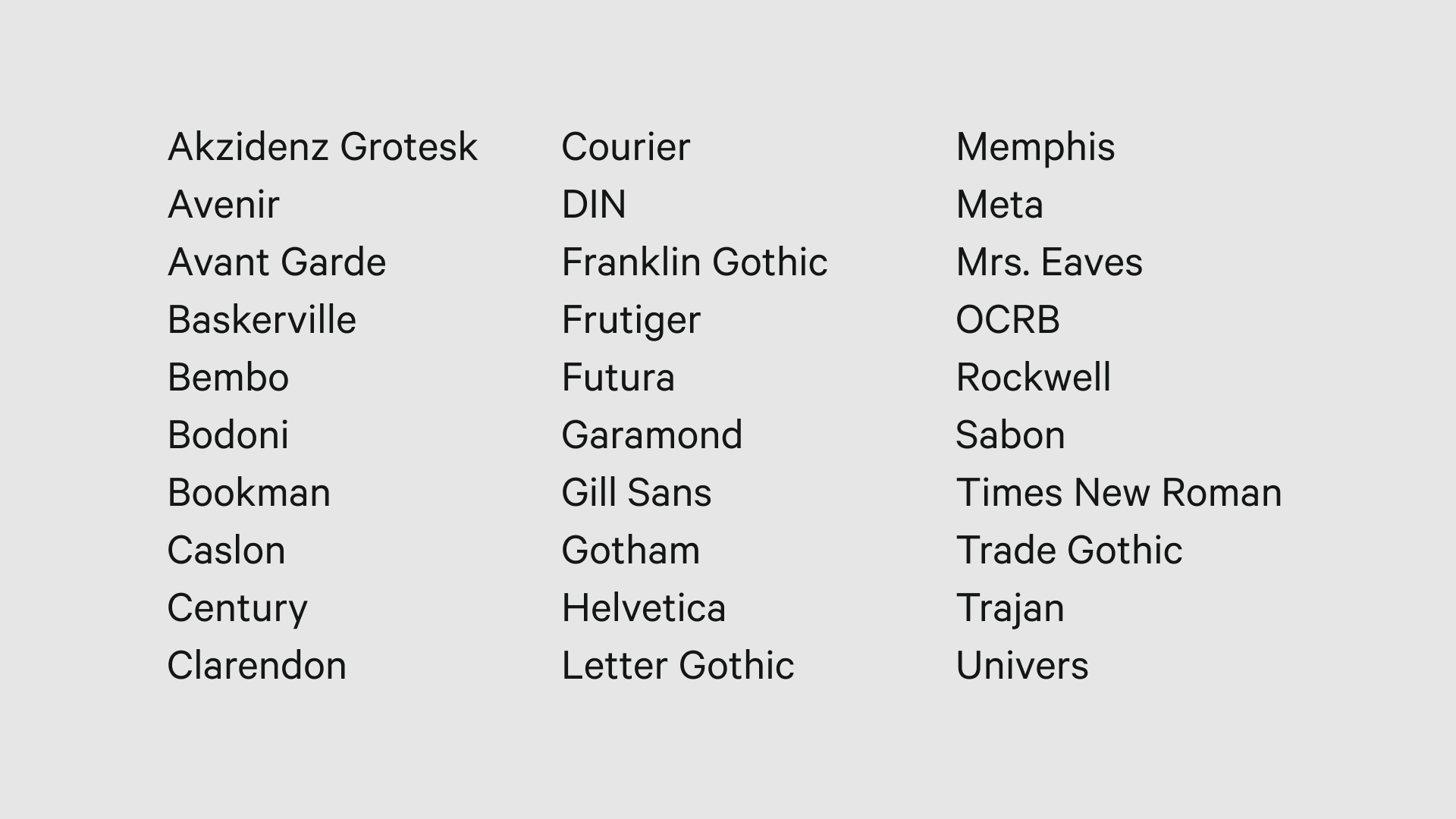
With an abundance of fonts to choose from, you can find plenty of beautiful, legible, and fresh options for your design. Here are some of our favorites:
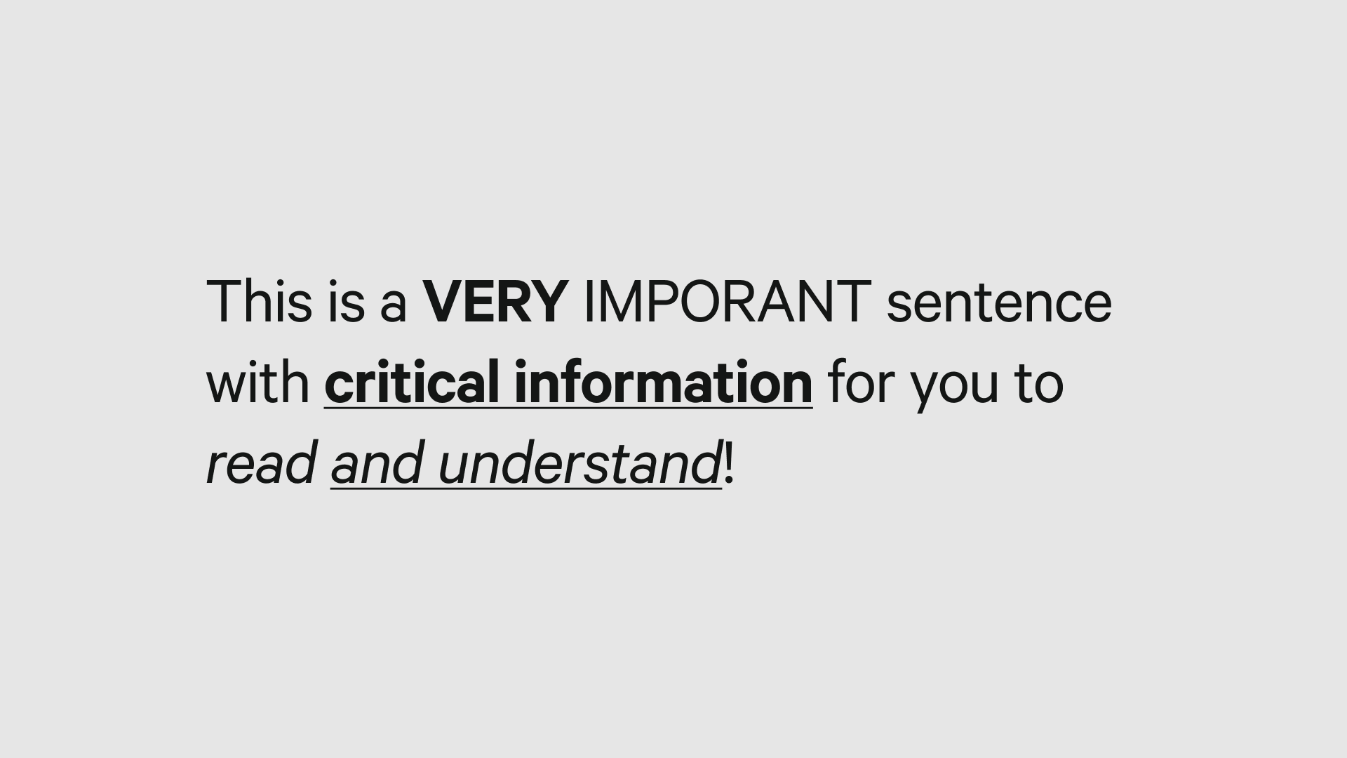
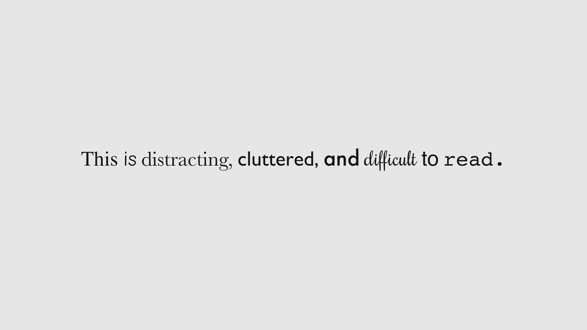
Crime #2: Using Too Many Typefaces or Font Styles
How many typefaces are too many? In general, especially if you’re new to typography design, more than two typefaces or font styles are unnecessary and unadvisable.
(Psst! Remember that a typeface is a family of fonts.)
What to do instead:
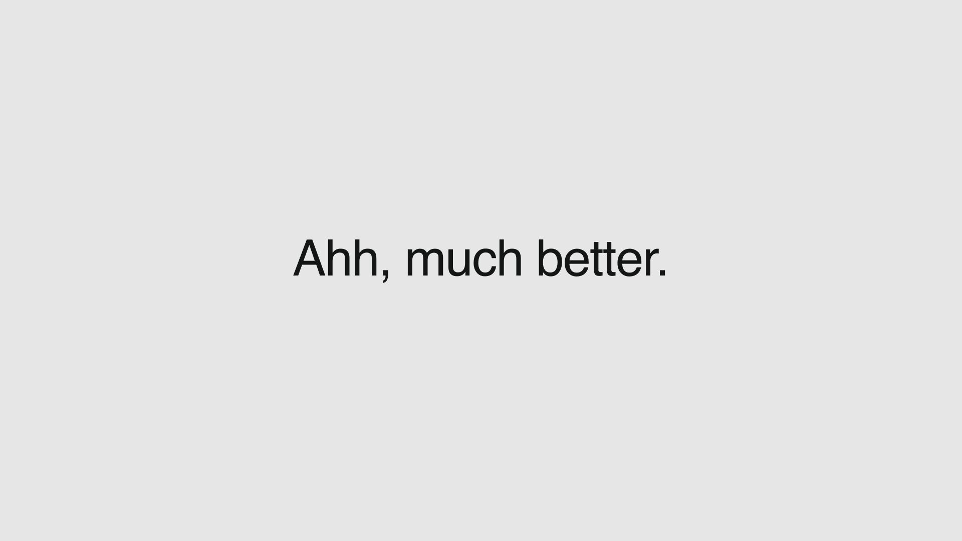
This one’s easy! Just… keep it simple! Stick to one or two choices and you should be just fine.
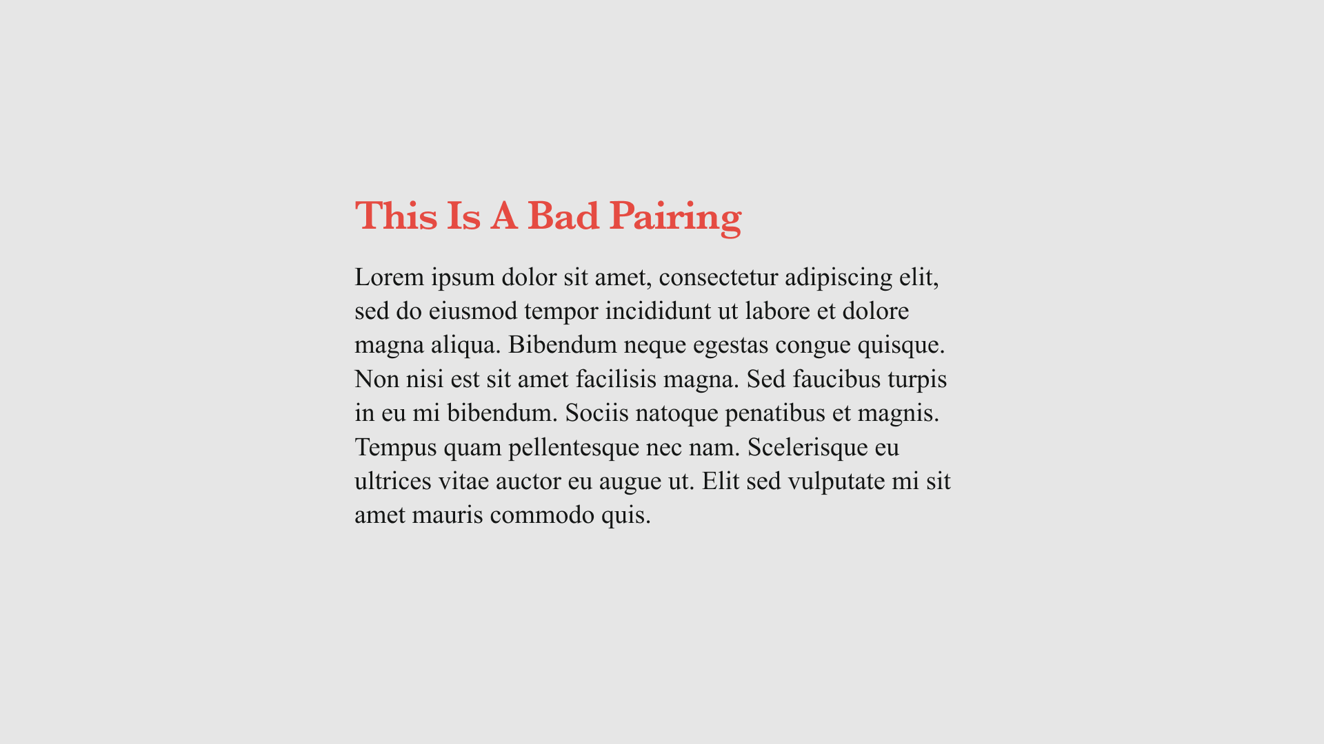
Crime #3: Poor Font Pairings
Getting down to two fonts is great, but it’s only half the battle!
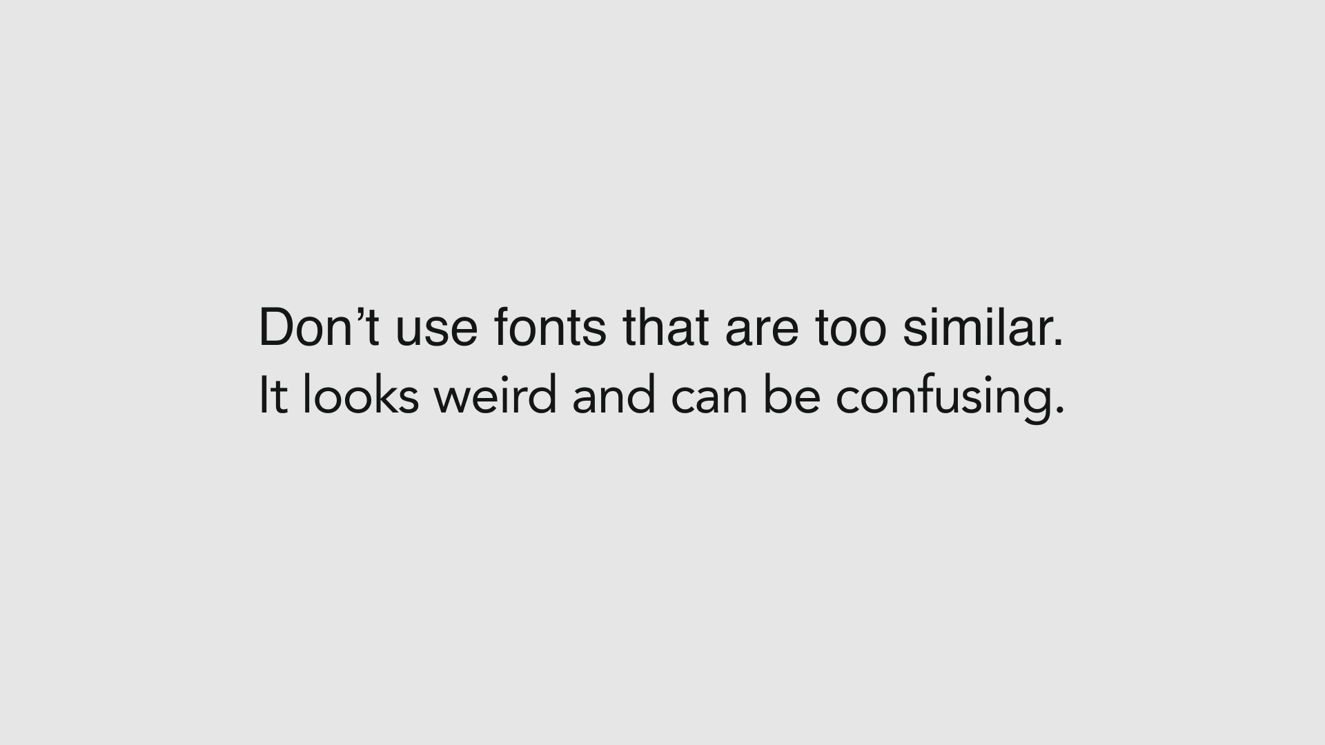
Using fonts that are too similar can lead to confusion for the reader. It takes away from the hierarchy you’re trying to establish or dampens the statement you’re trying to make.
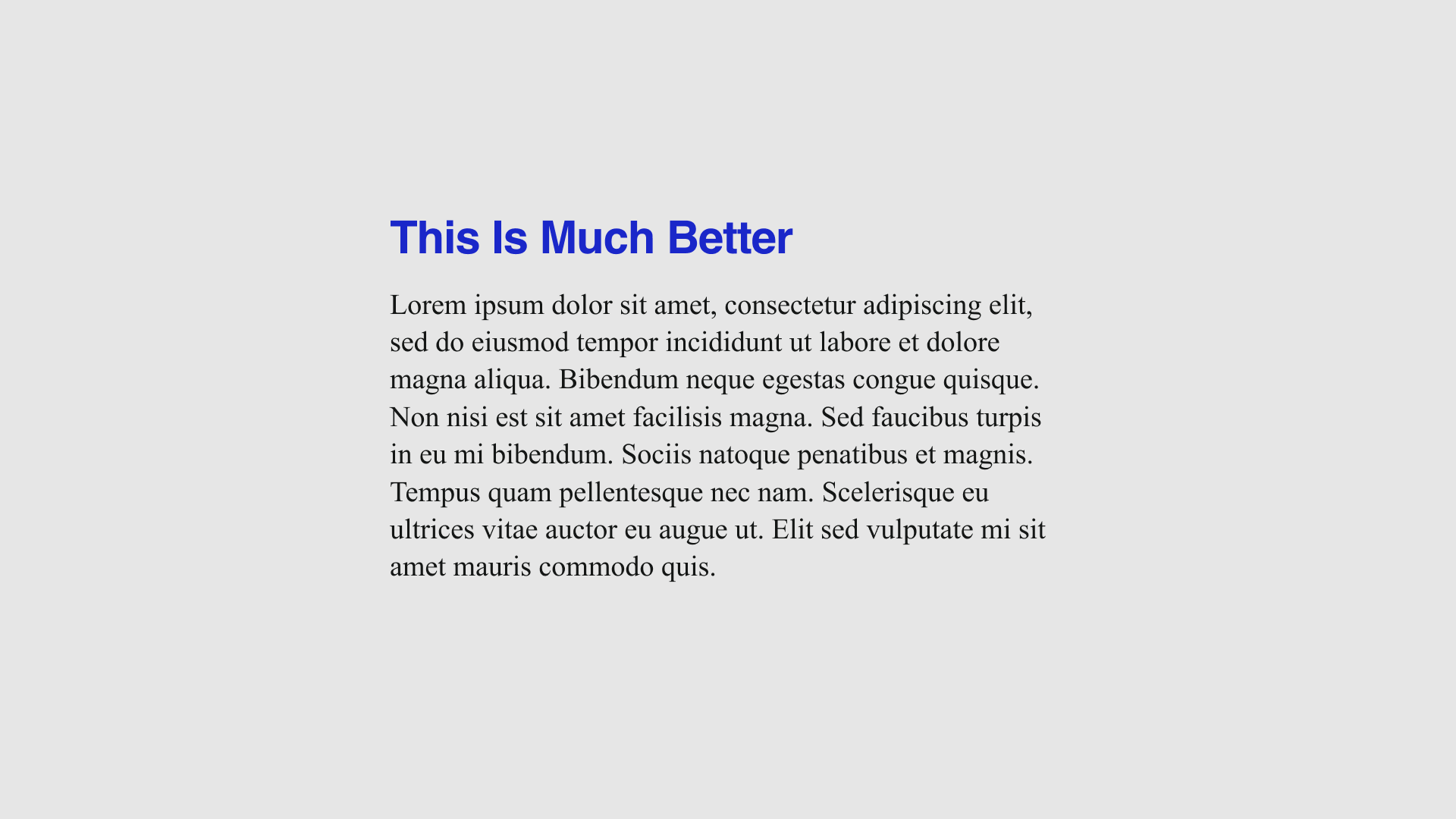
What to do instead:
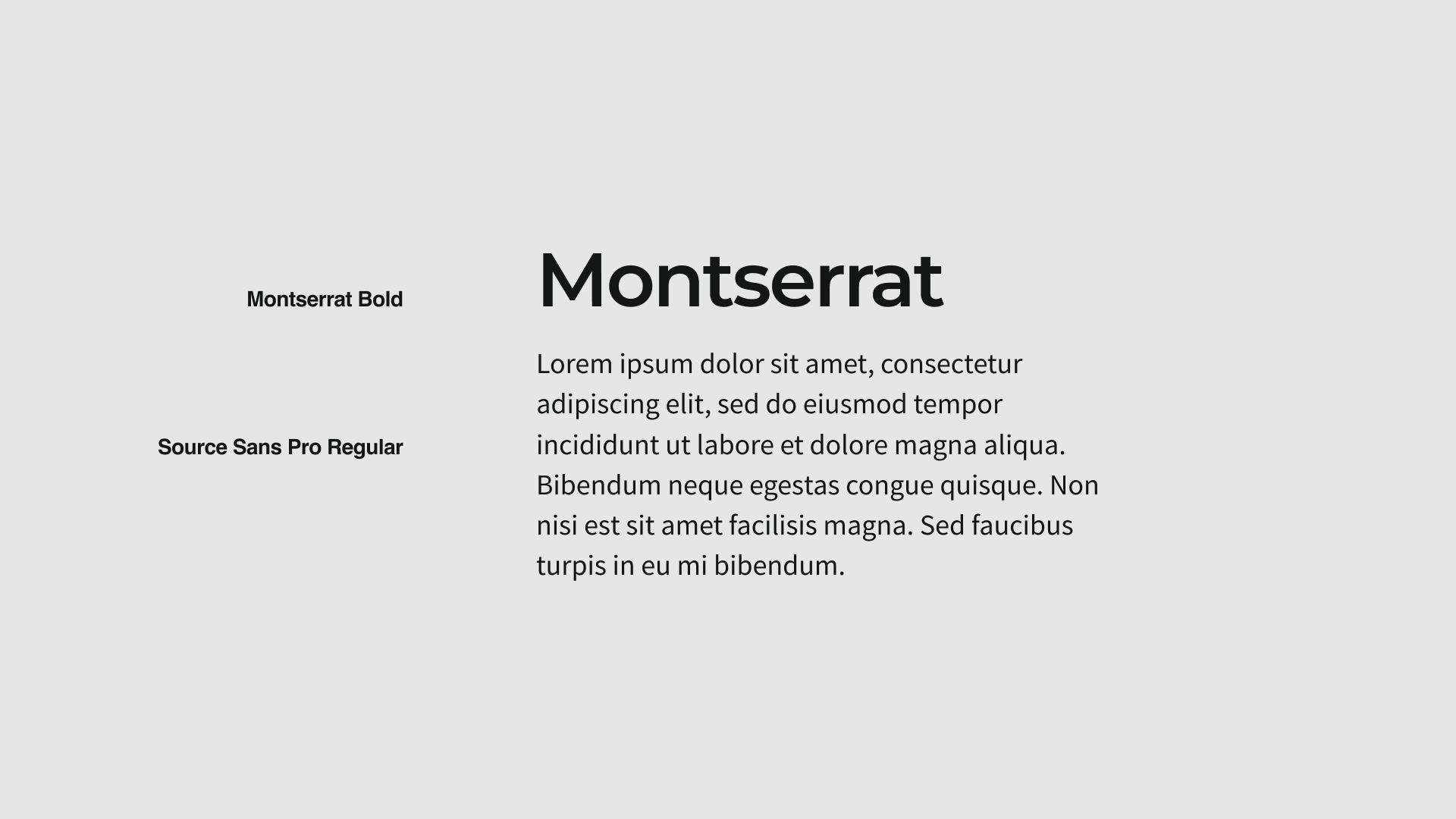
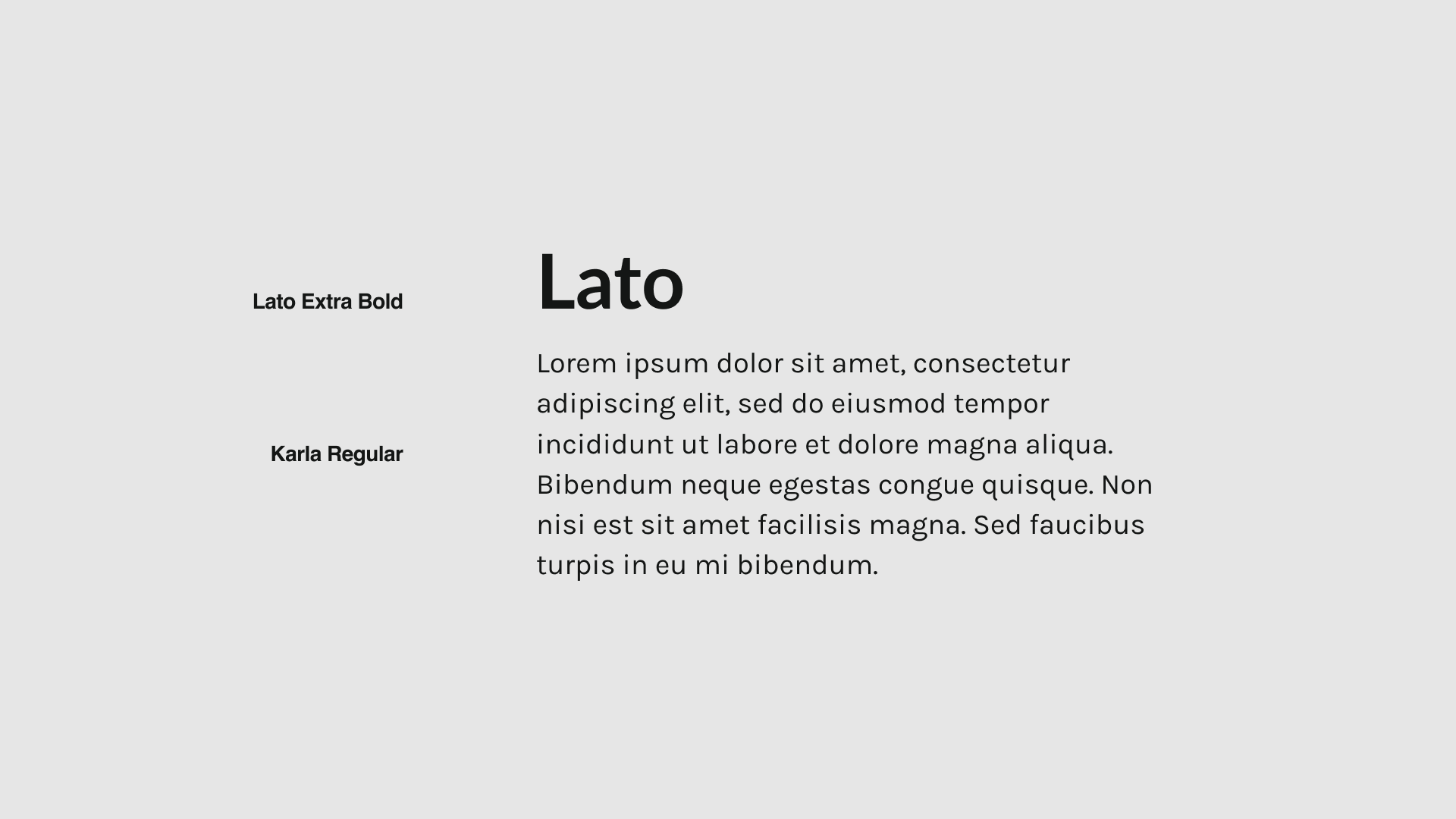
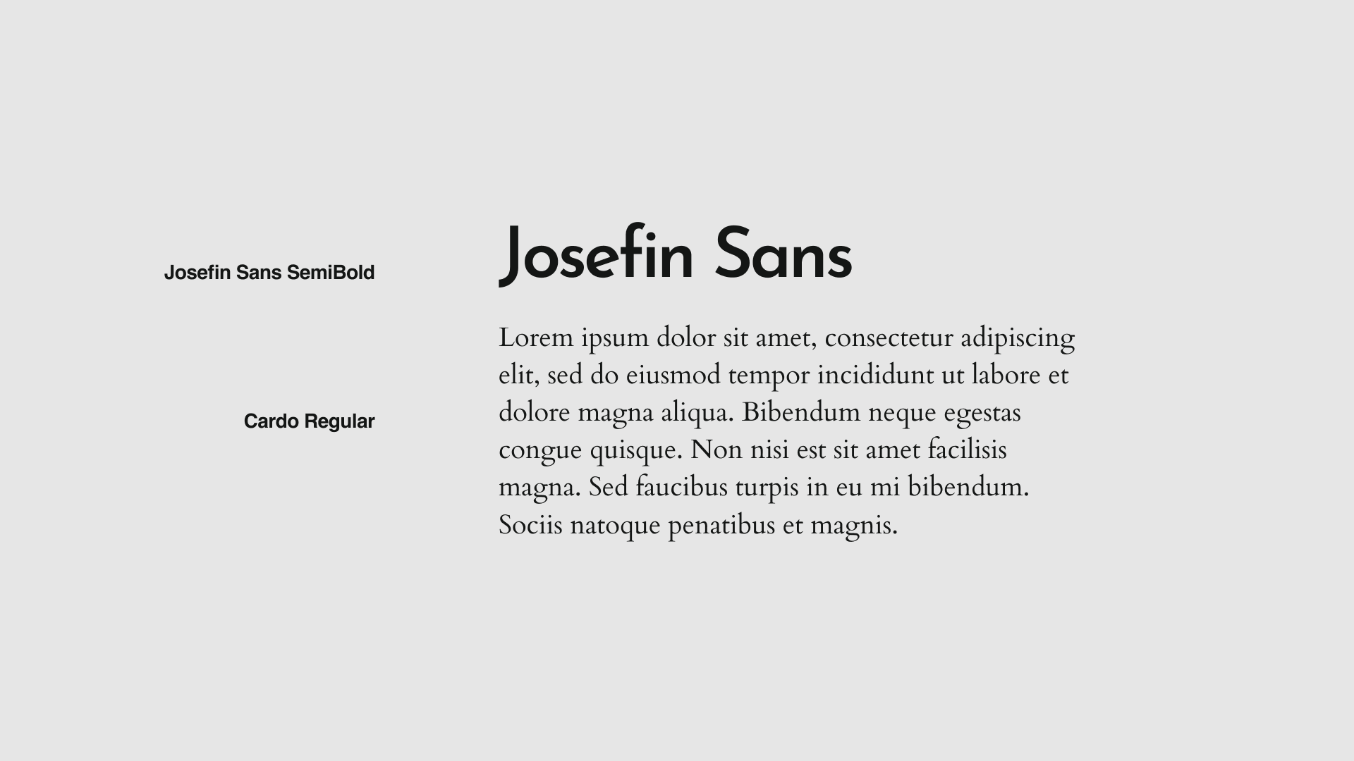
Pairing fonts together is a skill a lot like pairing wine with food. You could throw any two options together, but if you want a delicious design, it’s gotta be a perfect pair. There are so many combinations available- here are some good Google Font pairings:
Crime #4: Tragic Tracking
Quick reminder: ‘tracking’ is the uniform spacing between all of the characters in a block of text.
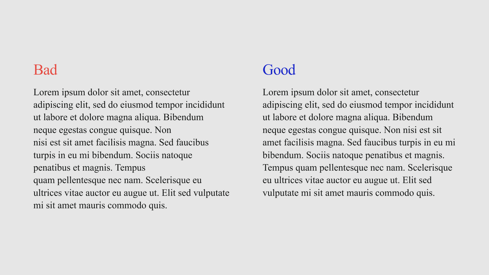
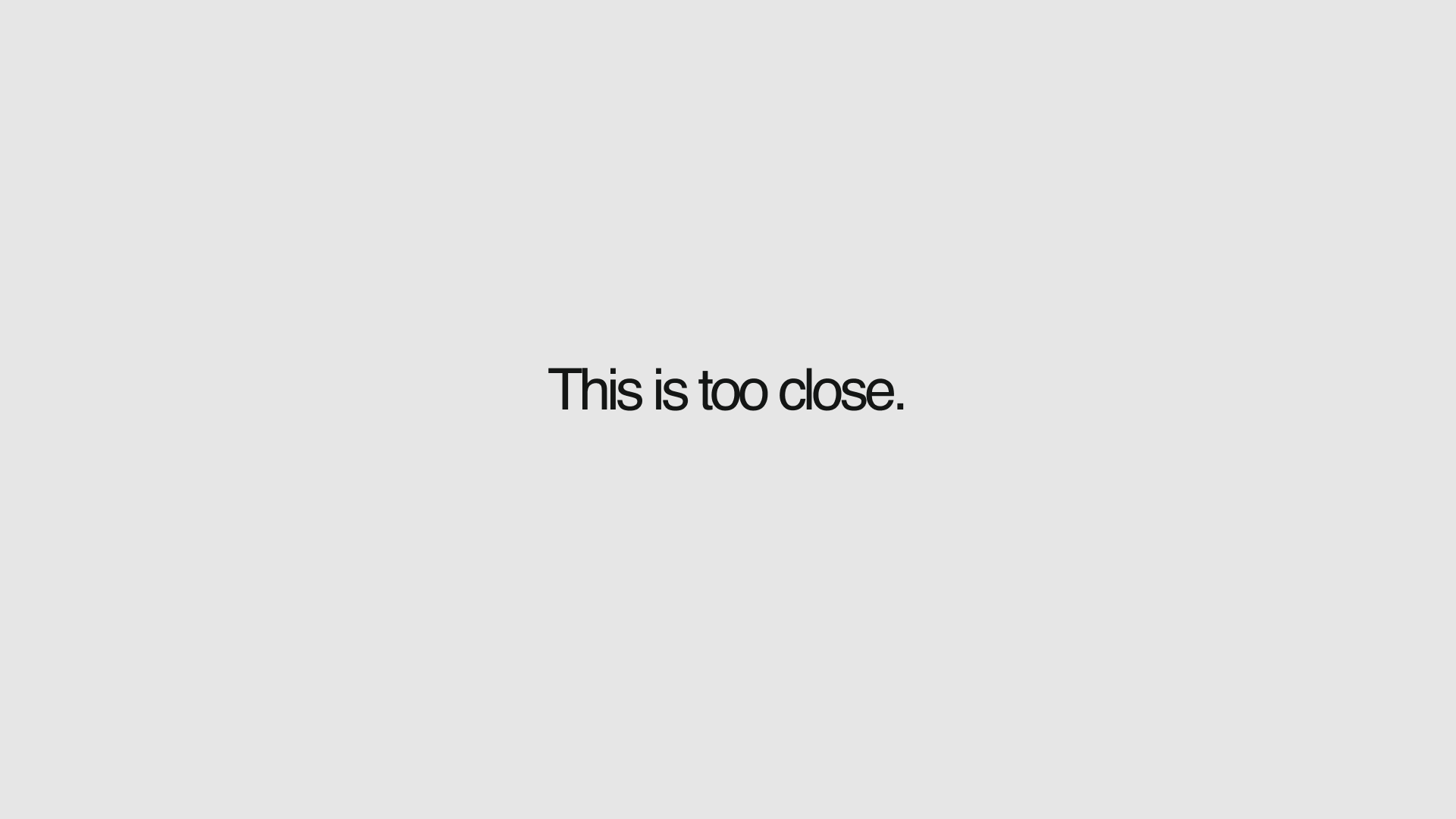
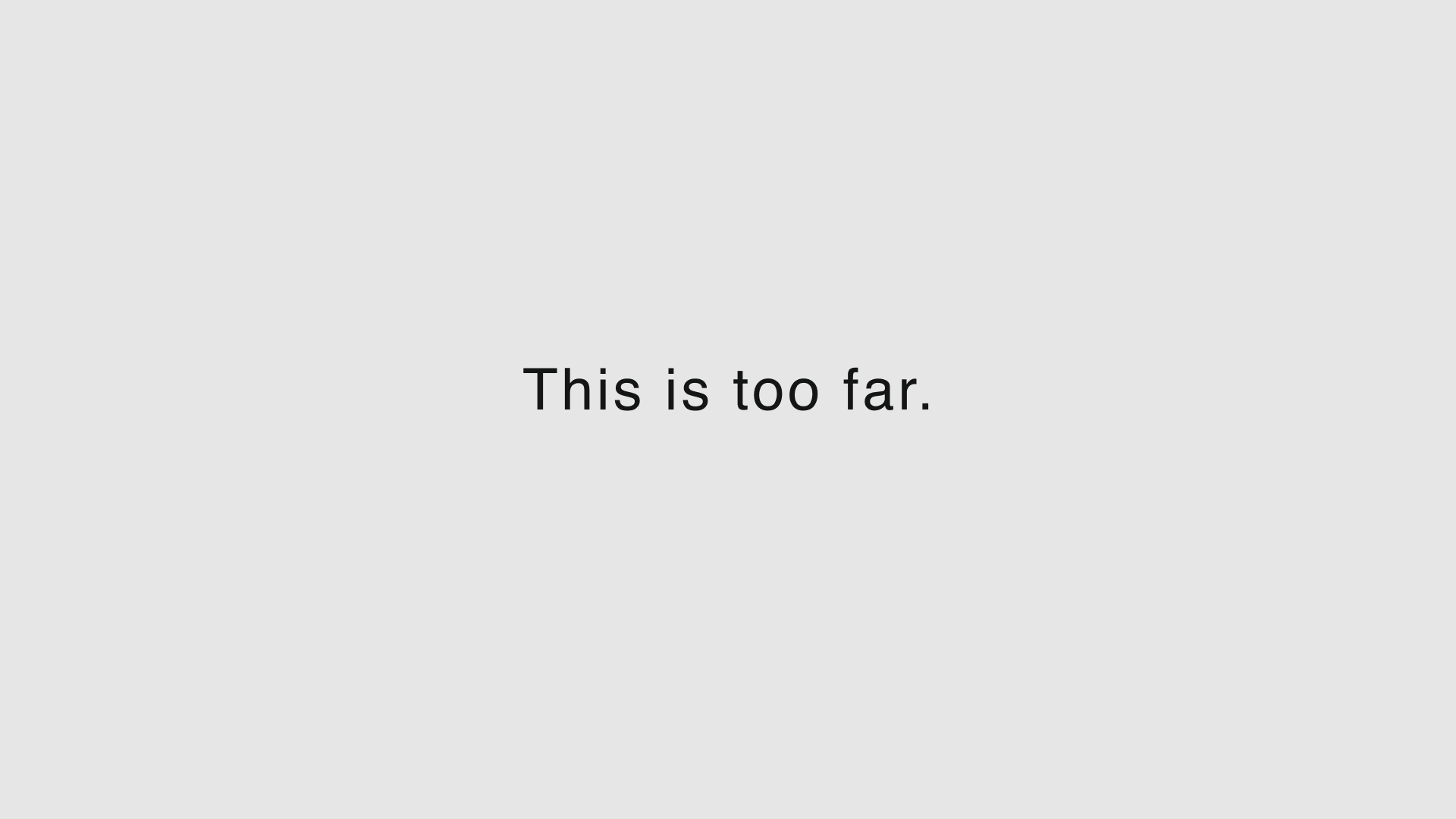
When letters are too close together they can overlap and become difficult to read. Too far apart and the individual words become difficult to parse out.
What to do instead:
To avoid committing that crime of “tragic tracking,” keep the following in mind as you make your adjustments.
Readability - Can you read the text easily?
Relationship - Can you tell what letters belong to which words?
As long as both of those things are true, you should be golden!
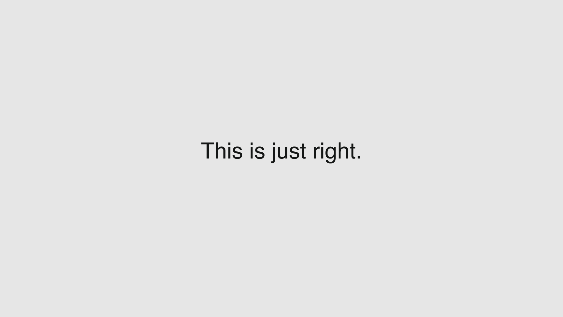
Crime #5: Stretching
Distorting your text can make it harder to read, pixelated, or just plain ugly.
So, please, no stretching, scrunching/squishing, slanting, or anything else that might destroy the beautiful shapes of the letters you’re working with.
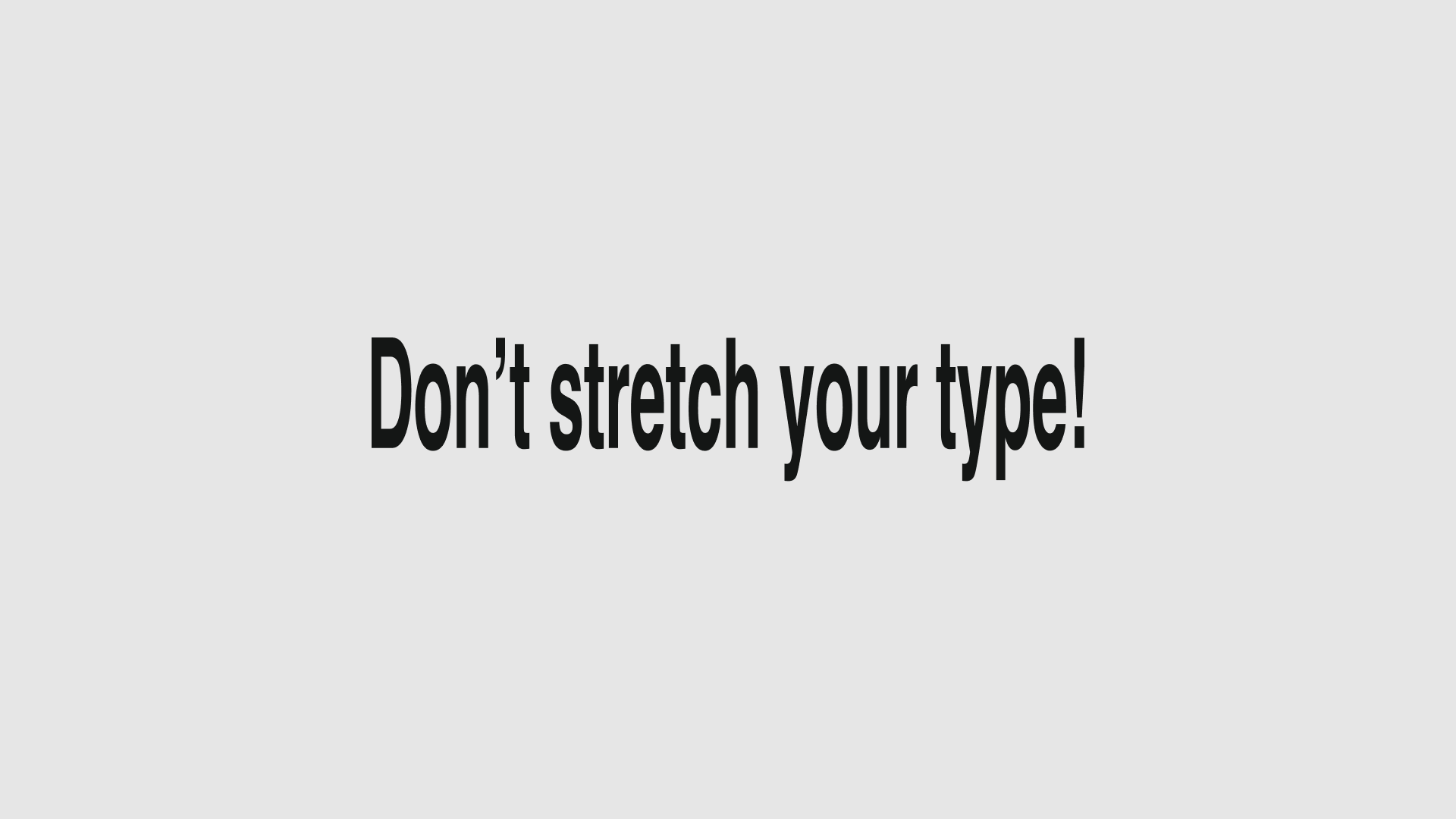
What to do instead:
If you’re distorting to change the shape or weight of the letters, use a different style of that same font. Depending on the font you’re using and the effect you’re after, that might be as simple as highlighting the text and clicking a button! Yep, that simple!
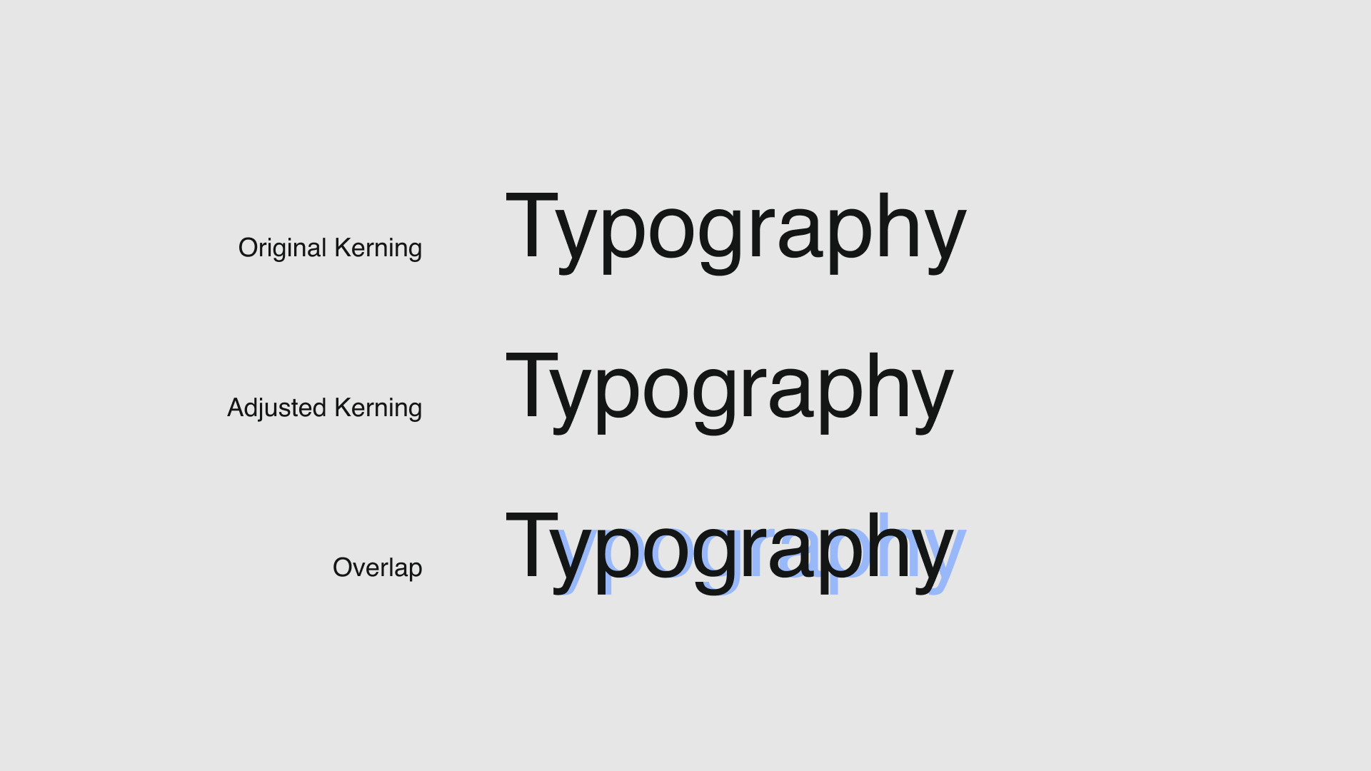
If you just want characters to be spaced differently, remember tracking. Tracking is a great choice if you want the spaces between all of the characters in your block of text to be adjusted together.
Now meet tracking’s cool cousin: kerning. When everything is perfect except for just one pesky letter that’s hanging out too closely with its neighbor, kerning has got your back.
Crime #6: Inappropriate Use of Hatch Marks (or Prime Marks)
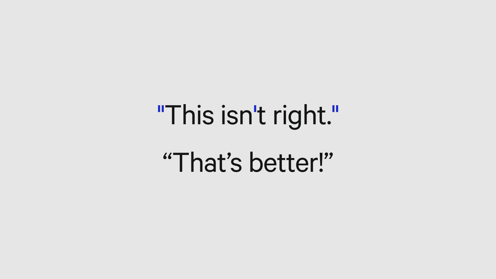
Hatch marks (or prime marks when we’re talkin’ ‘bout measurement), also called ‘dumb quotes’ are used for noting measurements, though so many of us accidentally use them in the place of apostrophes and quotation marks. This can get confusing, but mostly it’s just… wrong. (shudders)
What to do instead: